Let me explain.
No, there is too much. Let me sum up.
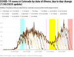
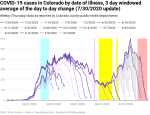
New cases of COVID-19 by date of illness onset are way up in all three graphs – raw data, filtered with a 3-day windowed average, and filtered with a 5-day windowed average. This week’s data was the first time that cases exceeded the April peak in the raw data, not just the filtered data.
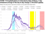
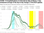
New hospitalizations by date of illness onset are up in all three graphs. They’re not anywhere near the March peak yet, and we don’t want them to get there.
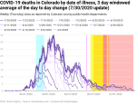
New deaths by date of illness onset are creeping up back in June. This is where we’d expect them to increase given reporting lags and the delay from illness onset to death. That delay was 19 days, but it’s increased to 22 days for reasons I don’t know. Hopefully it’s because hospitals are getting better at treating COVID-19. The longer the average delay is from onset to death, the better.
And new deaths by date of death are definitely up. Not a lot, mind you, but the trend has become undeniable.
To look at this weeks’ graphs, check out the gallery below.


Now, with that summary out of the way, let’s look at a couple of details.
Cases vs. case positivity percentage
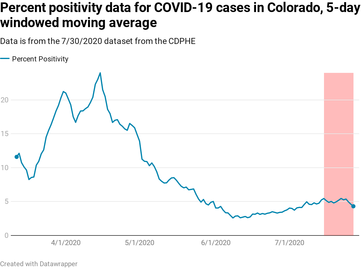
But that much higher testing rate does mean that the recent spike in new cases of COVID is partly due to much higher rates of testing, and that makes it more difficult to compare the current rise in cases to how COVID was circulating in Colorado back in March and April.
One of the things we can use to help get a better handle on this is by comparing the percent positivity rate. This is the percentage of positive tests in a given week divided by the total number of tests performed that week. This has its own set of problems when the total number of tests is small, but it will still give us a better idea than relying on just the total number of cases alone.
The graph at right shows the percent positivity on a day-by-day, and it shows that the number of positive cases is increasing and has been since early June. As with my other graphs, the red highlighted region is the data that is too new to be trusted.
A word of warning about this graph, however. We cannot assume that the percentage of positive cases from March and April is accurate. When there are only a very small number of tests available, doctors will not refer every suspected COVID patient to be tested. I know someone who very clearly had COVID, but his doctor did not have him tested because his symptoms were so overwhelming COVID that the doctor’s expert opinion was that a test was not required. This effect will tend to drive down the positivity percentage.
Also, when there are very few tests available, doctors won’t want to waste a test on someone who has such mild symptoms that they could have just a run-of-the-mill seasonal cold. Given this virus can produce symptoms no worse than a seasonal cold, not referring colds to be tested would tend to inflate the positivity percentage.
The same effects occur when testing is widely available, but they create less error.
While I can describe these effects and what they’d do to the graph, I’m not an epidemiologist so I don’t have the expertise to attempt to correct the data for these effects. For that we’ll need actual experts.
Deaths by date of illness vs. deaths by date of death


In the graph at top right, I’ve plotted the new deaths by date of death as tracked in four separate datasets in July. Unlike the overall data curves, I’ve focused on just the period since June 1, shortly before new COVID cases started rising so we can look more closely at what’s going on.
We can see that the high point since June 1 was about ten new deaths per day and that the low point was about two new deaths. We can see that, since the low point, new deaths by date of death have risen to about five. This is still well below June’s peak, but well up from the low point.
We can also see with the gray shading that reporting lag has resulted in revisions to the number of new deaths, and that in the period since July 2 (the low point of the graph) the revisions have always been upward.
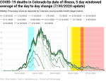
The question I want to answer is this: where does the increase in new deaths by date of death show up in the new deaths by date of illness onset?
The graph at bottom right shows the new deaths by date of illness onset for the same four datasets in July, and plotted for the same period of time – June 1 through the latest update (which was July 24 in the 7/30 dataset). It clearly looks quite different from the graph of deaths by date of death, but it should look different.
The peak in deaths by date of illness was in early June at 5.6 new deaths per day, but then the 7/9 dataset showed new deaths dropping a lot. The 7/16 dataset showed less of a drop, and a significant increase over the 7/9 dataset. There was another increase going to the 7/23 dataset, and the most recent 7/30 dataset shows that we’re seeing a peak in new deaths by date of illness onset on or around June 27.
The gray highlighted regions show just how much data has changed from each individual dataset to the most recent 7/30 dataset, and the increase is significant.
In last week’s COVID update I wrote
I expect that we’ll see more increases over the coming weeks. New deaths by date of death (see below) will always drive changes to the new deaths by date of illness onset. After all, almost no-one who enters the hospital with COVID will die that same day.
And this is what we’re seeing in this data.
When someone dies of COVID, the date of their death is known immediately. The date on when that person showed symptoms may be known from their medical records, or public health officials may need to talk to the person’s family or friends to learn when the deceased first showed symptoms. That date will always be some amount of time before death, and that’s why people dying of COVID today show up in the past data for death by date of illness onset.
As I mentioned above, the average length of time between showing COVID symptoms (aka “illness onset”) and dying of the virus was 19 days just a few weeks ago and it looks to be lengthening to something more like 22 days. Add reporting lag (which can be insanely long for deaths by date of illness onset – I’m calculating 34-40 days to stabilize to within 80% of the final total at the moment) and the entire period shown in the bottom right graph is subject to significant revisions due to people dying of COVID today.
But the answer to my question is pretty clear from the graphs. The people dying today are showing up in the data for late June and early July in the data for deaths by date of illness onset. And they will continue to do so.
—
Not only are new cases up, but the percentage of positive cases is up too. Hospitalizations are going up and so are deaths. These facts are why Governor Polis issued a statewide mask order a couple of weeks ago, but it only applies in public spaces where people cannot social distance.
Unfortunately, that’s unlikely to be enough. What should be happening now is we should be aggressively requiring social distancing and masks both. We should start issuing tickets and fines to people who are not wearing masks.
And we should most definitely not be reopening the public petri dishes otherwise known as schools.
As always, I’m not an epidemiologist, just a guy who can do math and make graphs that help to explain data. If an actual expert contradicts me, take their advice over mine (no, Donald Trump and his various minions are not actual experts). That said, the experts continue to recommend wearing masks, social distancing, regular handwashing, and avoiding large groups, especially indoors.

Leave a comment