 Schools are expected to reopen across Colorado soon. But COVID-19 cases are rising, and a lot of people seem to be resistant to following the public health guidelines proposed by Governor Jared Polis and the Colorado Department of Public Health and Environment. As a result, reopening schools is premature at best. The data below will help illustrate why.
COVID-19 cases in Colorado, by day of illness onset
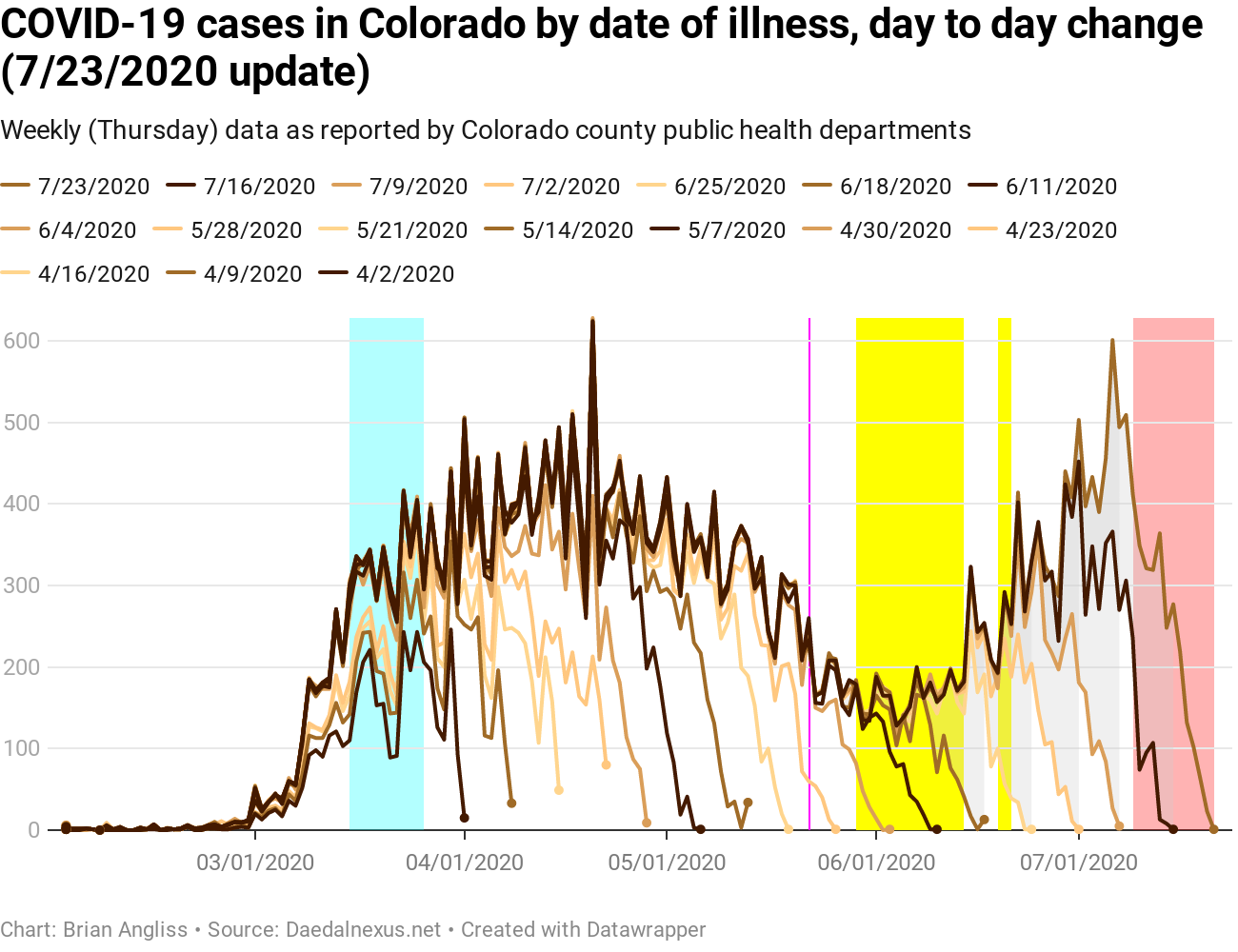

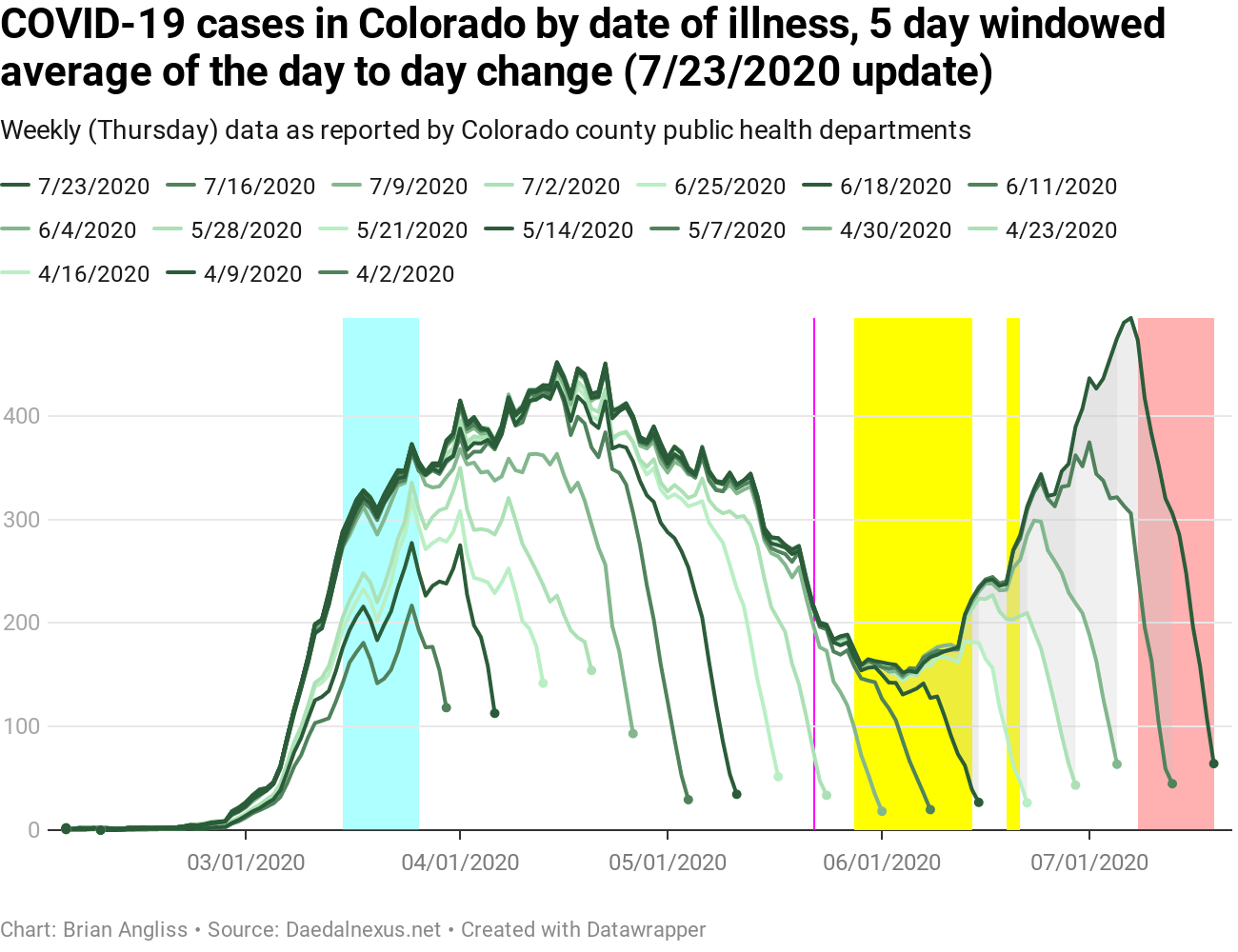
Cases are up. Way up.
In the last week, the unfiltered new cases by date of illness onset rose to nearly the same peak as back in April. The April peak was 625 new cases, while it hit 601 new cases on July 6.
In the 3-day and 5-day windowed moving average graphs, July 7 has become the new peak in cases, exceeding the previous peak in April by about 70 new cases in the 3-day windowed average and about 50 new cases in the 5-day windowed average.
The question we have to ask is if the cases represent a dramatic increase in the number of cases, or a dramatic increase in the number of tests. And in this case, it’s some of both.
Statewide, the percentage of positive cases in April hit a peak of just over 25% on April 15. The recent rise in cases, on the other hand, is about 5.8%. This is much lower, and it means two things. First, there are certainly new cases statewide. Second, the spike isn’t as big as it appears because we were testing so few people in March through May that we were almost certainly missing a large number of cases.
What we have to ask ourselves is whether the original surge in cases in March and April would have looked more like this if we’d been testing more. I’d hazard a guess that the answer is “yes,” but that’s just a guess on my part. I tried a simple scale factor, but it produced absurd results that are clearly non-physical, so adding a scaling factor isn’t going to be a simple exercise.
COVID-19 hospitalizations in Colorado, by day of illness onset
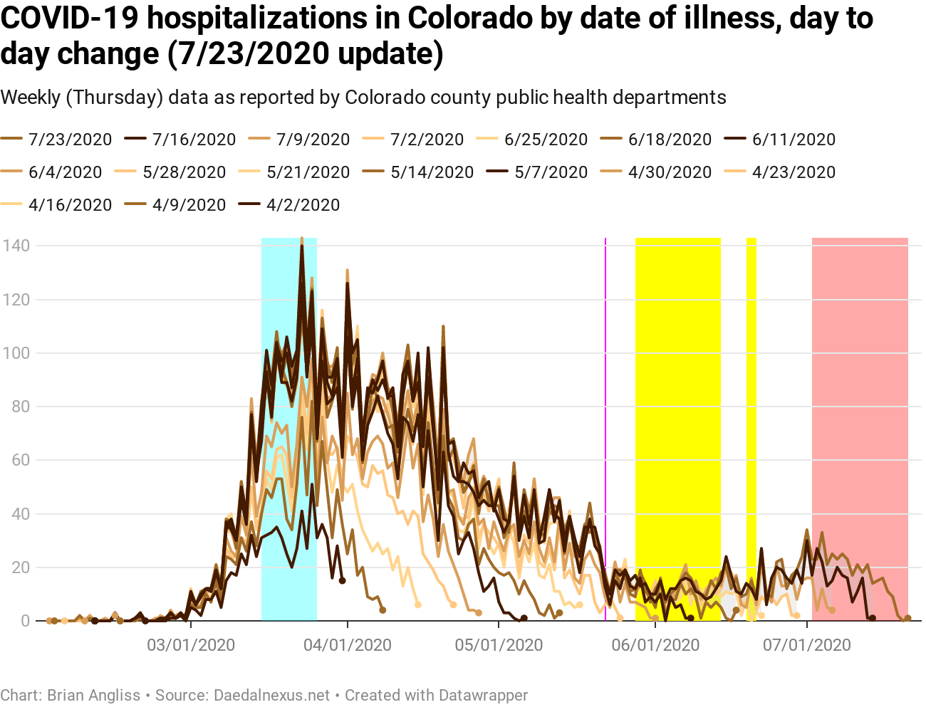
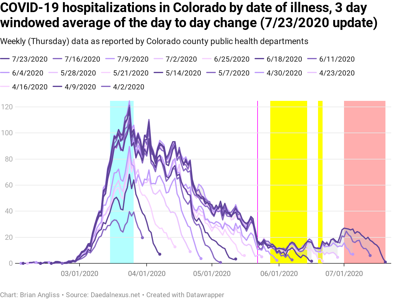
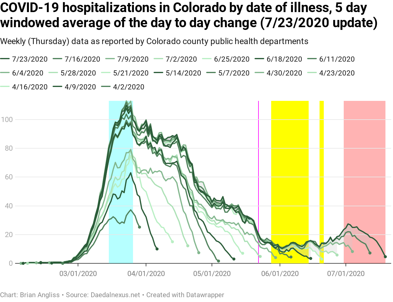
New hospitalizations are also now going up. They were starting to rise last week, but the rise wasn’t that large or much outside the noise. This week there’s no question whatsoever – new hospitalizations are increasing.
Unfortunately, hospitalizations bounce around a lot, and as the number of new hospitalizations increase, the time it takes to stabilize also increases. Two weeks ago the stabilization time (the number of days that it takes for the data to enter 80% of the final value) was about 10 days. This week it’s 20. Which means that the red area at the end of the data that shows the range where we can’t trust the data has grown nearly as fast as time has passed.
That’s not a good thing, because new hospitalizations are a more accurate indicator than new cases. There’s a tarnished silver lining to this particular cloud, though – even at the peak of new hospitalizations in April, the delay was never longer than about 30 days. But we really don’t want to wait a full month to know what’s going on with hospitalizations. That’s no better than relying on deaths, which we don’t want to do either.
Looking at the graphs of the 3-day and 5-day windowed averages of the data and we can see that the edge of the “can’t trust this” red highlighted region goes right up to the recent peak (local maximum) of the data. Which means that we can probably expect the peak to keep on rising through the next week and, unless we make more aggressive change to our behavior statewide, the foreseeable future.
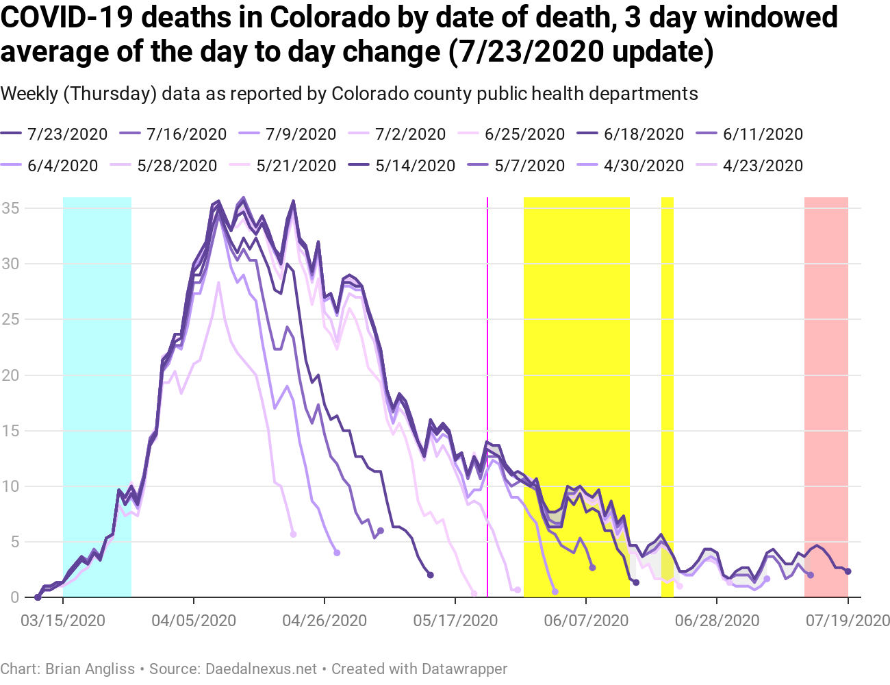
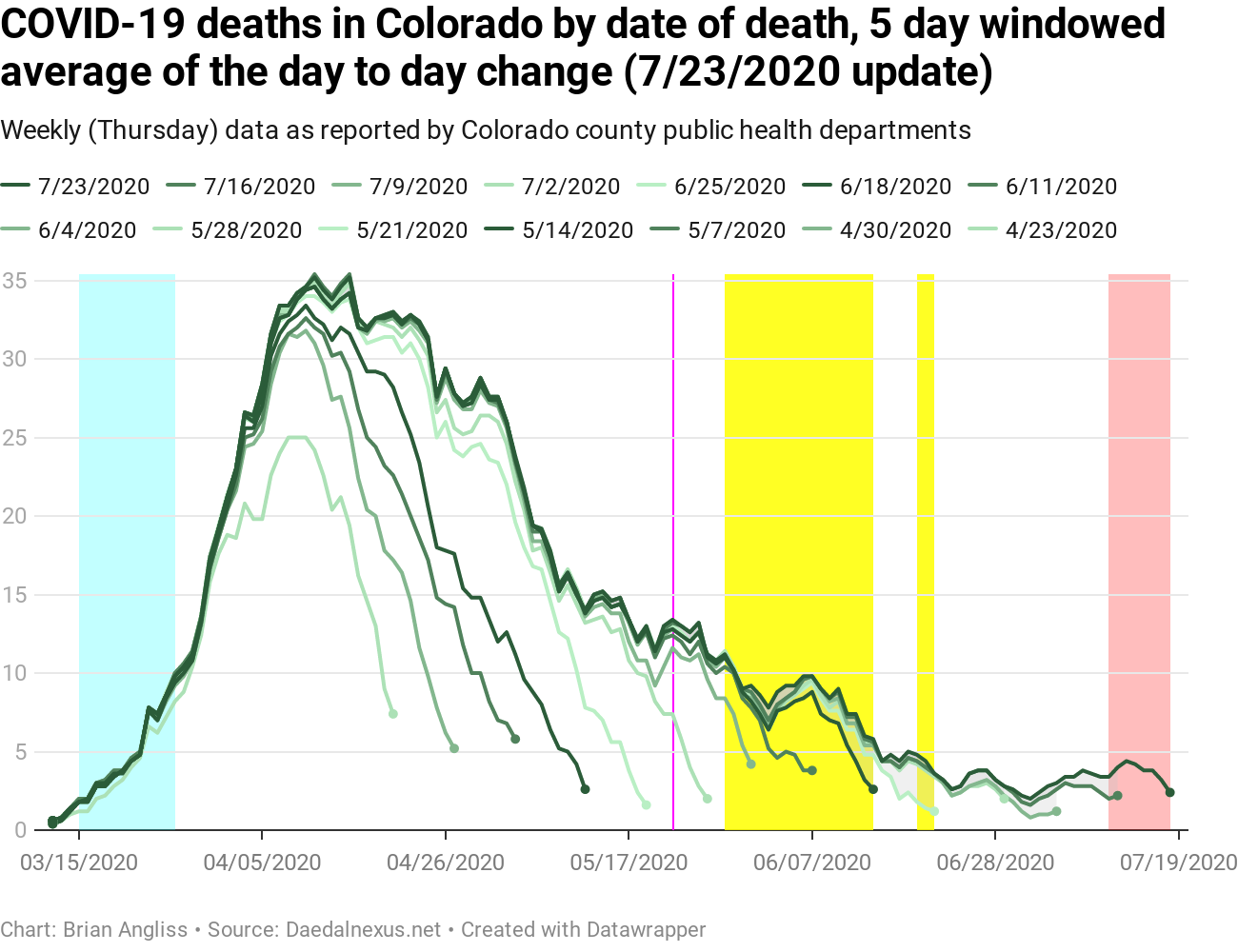
COVID-19 deaths in Colorado, by day of illness onset

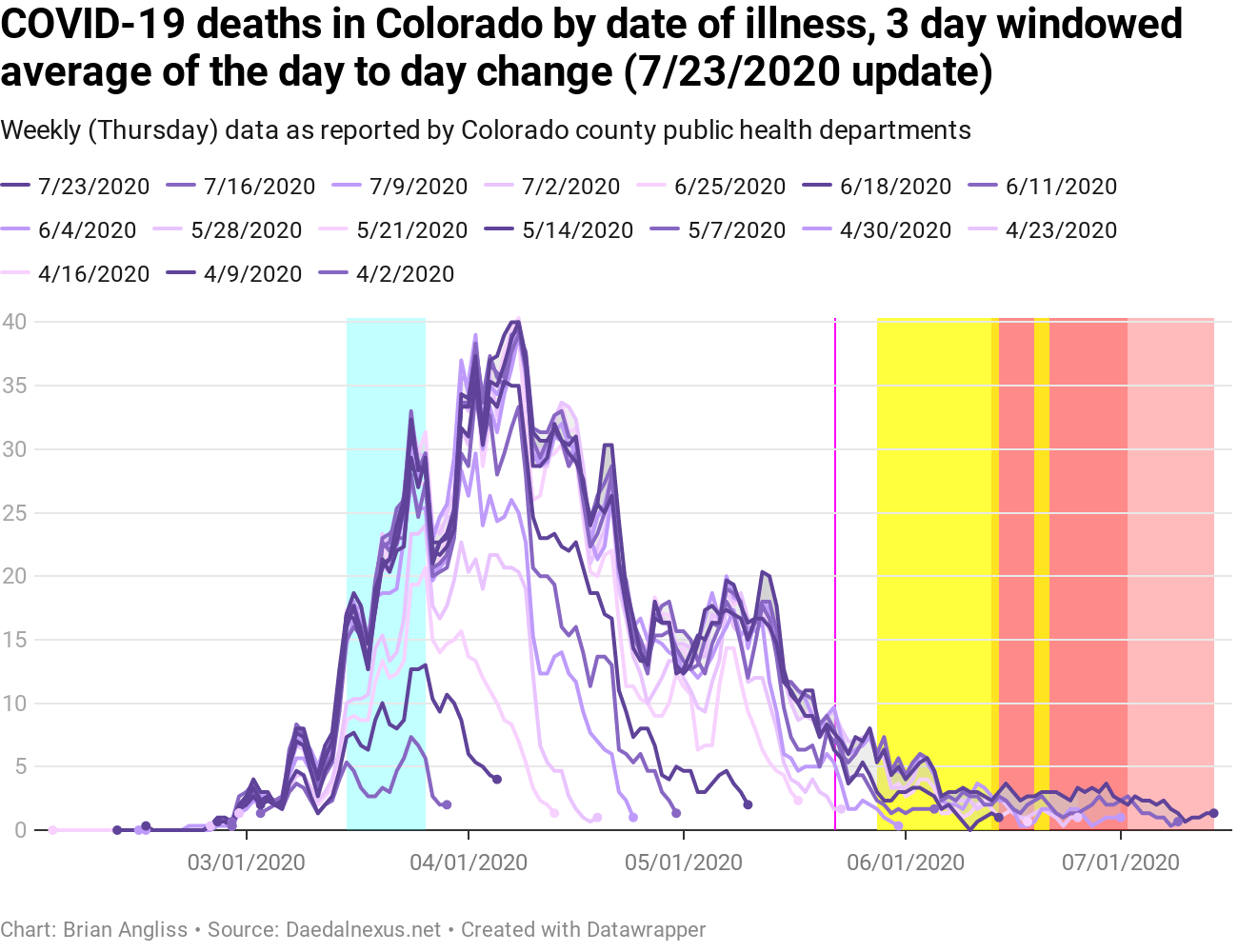

It’s really difficult to look at the raw data for the new deaths by date of illness onset and see any recent changes. Everything looks like it’s bouncing around within the usual noise bands. But as I said last week, given the 19 day average delay between onset and death and the additional reporting lag, we wouldn’t expect to see much yet.
This week is arguably worse, however, because the metrics I’m using to track the reporting lag went crazy in the last week. Lag rose from 13 days or so to more like 40, and I’m not entirely sure why. The graphs shown don’t show the extra-long lag, though, since I don’t understand why it rose so much. But even without a 40 day lag, we’re still looking at a total lag of about 32 days. And we’re still looking at new deaths by illness onset showing up in data that could be 30 or more days ago.
Now that I think of it, that could be why the lag got so long – new deaths are showing up 3-4 weeks ago. If that is the cause, then I need to adjust my lag-measurement methodology to take this into account better. More to think about.
If you look at the 3-day and 5-day windowed average graphs, you do see that the number of deaths in mid- to late june look like they might be creeping up just a bit. Which is where we’d expect to see the number of new deaths by date of illness onset start to increase.
At this point, I expect that we’ll see more increases over the coming weeks. New deaths by date of death (see below) will always drive changes to the new deaths by date of illness onset. After all, almost no-one who enters the hospital with COVID will die that same day.
COVID-19 deaths in Colorado, by day of death
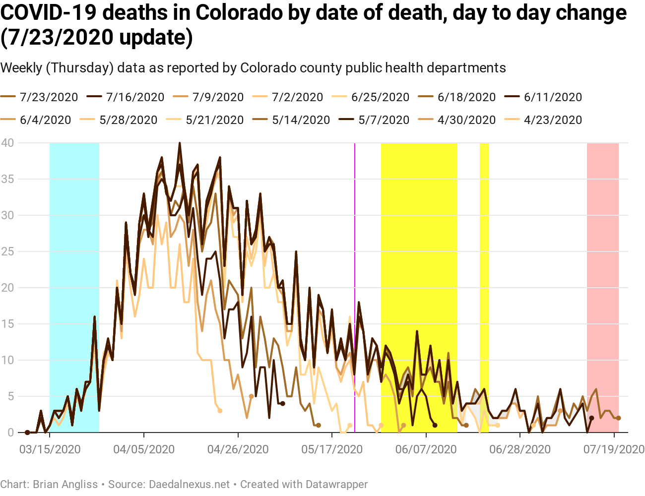
Unlike all the other data above, the “don’t trust the data” zone for the number of new deaths by date of death hasn’t grown at all in my latest check. It’s still 5-8 days, which is quite short compared to many other states. In the graphs at right it’s 8 days.
Unfortunately, the data shows a clear rise in the number of new deaths in the last week or so. It’s partly in the red zone, so we can’t trust that the rise shown is stable (it may go down a little or up a lot – hopefully the former, but I think the latter is more likely). New deaths have clearly started to increase again.
Given there’s a high degree of correlation between new hospitalizations by date of illness onset and new deaths by date of death (0.913 with a delay of 19 days), I may be able to calculate what the percentage of people who entered the hospital who later died was from the first period of infection so that we can see if the current strain of the virus is more, less, or similarly lethal. Something for another week.
—
So what does this all mean?
First, it means that too few people have been following public health guidelines to wear masks, social distance, wash hands regularly, and avoid large gatherings, especially indoors. If we’d all be doing this collectively statewide, cases and the like would be flat or still dropping, like they are in New York, Connecticut, and Massachusetts. Instead we the residents of Colorado reopened too much too fast and acted like the virus was gone when it very much was not.
Second, it means that there is no way we can reopen schools for 100% in-person like the virus is gone. Most students are terrible about hygiene at all ages, are impulsive enough that they struggle with social distancing, can wear masks but often won’t (or can’t wear one properly/avoid playing with it), and schools are pretty much the definition of a large, indoor gathering.
For reference, Georgia Tech has a COVID event risk tool that takes the rate of infection in your county, the size of the gathering, and then calculates the likelihood that there is at least one person in the group who is COVID positive. As of today, Jefferson County, Colorado has a risk of 58% for a group of 100 people. That’s the minimum number of fellow students a high school student is likely to interact with. And just a few days ago the risk was only 52%.
The risk for a group of 500 (a small high school)? 99%.
Anyone calling for 100% in-person schooling isn’t being realistic at this point. If cases and hospitalizations in Colorado had stayed down, that would be one thing. But they haven’t.
As always, I’m not an expert, just someone who can do math with a keen interest in this subject. If local public health experts say something different than I do, follow their advice over mine.
