It’s been two weeks since my last update, so there’s a bit more to talk about.
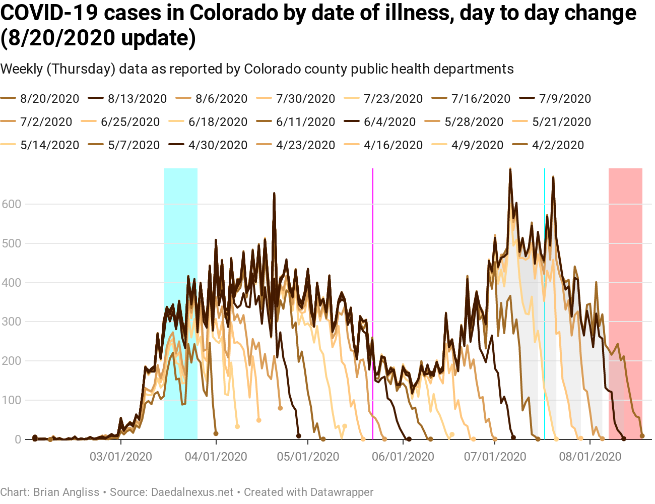
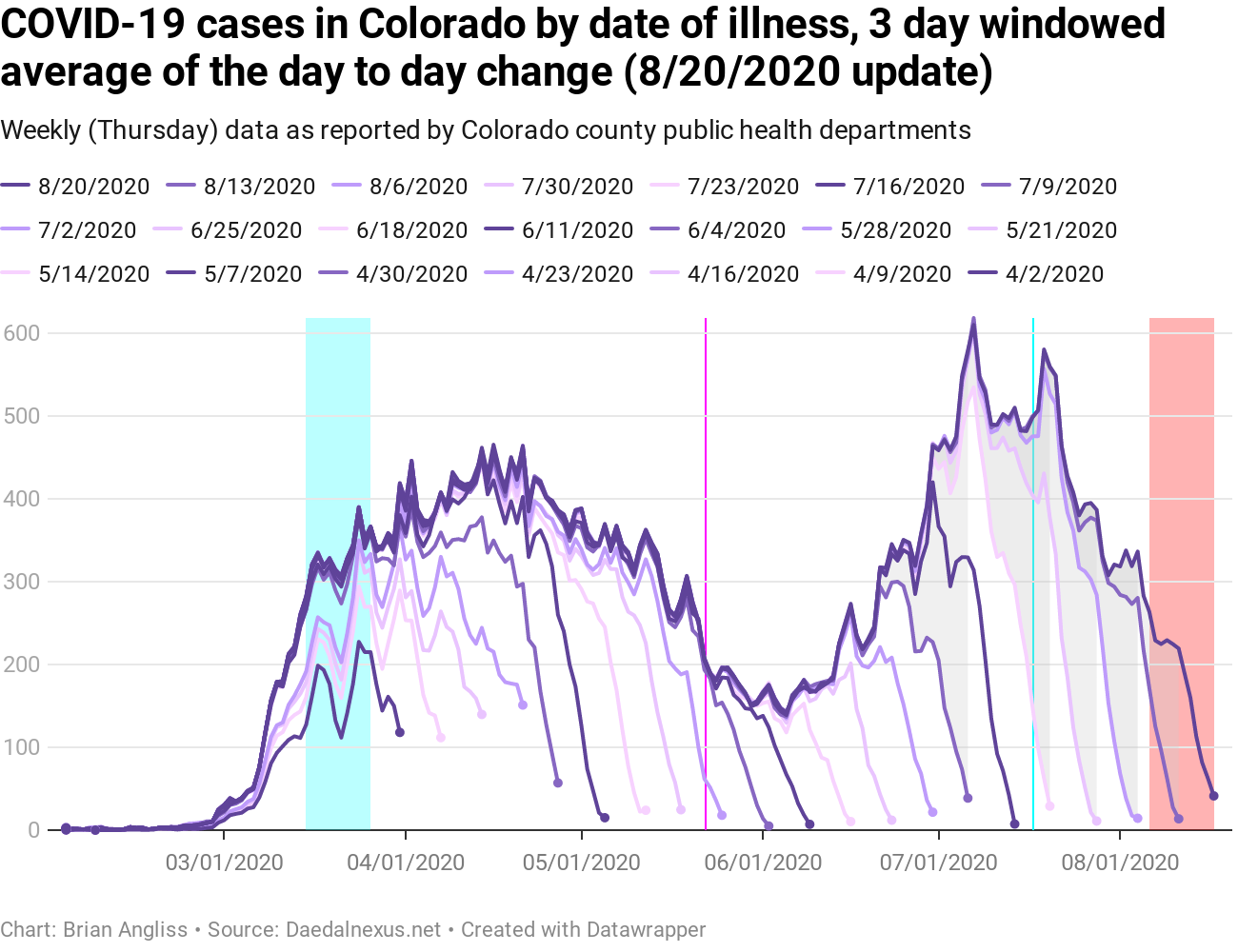
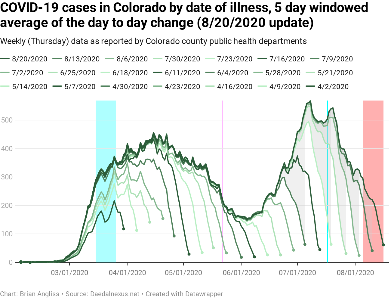
First, I’ve added back one of my old highlights into each graph and added a new one. In addition to the large cyan highlight in March when Governor Polis was instituting various orders to protect Coloradans from COVID-19, I’ve added back the magenta line when most schools were let out for the summer (May 22) and added a new cyan line when Polis instituted the statewide mask mandate on July 17. And the red highlighted region remains the period where we can’t trust the data due to reporting lag.
In the graphs of new cases by illness onset, we can see that there was a significant drop in cases starting almost immediately after Polis’ July 17 mask order. However, correlation is not causation, and given the rise in new cases had stopped about a week prior to the mask order, it’s hard to say with any certainty based on just new cases whether or not the mask order had a measurable impact or if some other effect was the cause.
Regardless, the number of new cases is coming down again, which is good. We’ll know more looking at the test positivity data and the new hospitalizations data below.
Even better is the fact that the test positivity data is down. After hitting about 5% (which was what triggered Polis’ statewide mandatory mask order), it’s dropped to below 3%, which is about the lowest it’s been since COVID-19 first showed up in Colorado in March. [NOTE: In case you haven’t been following my regular analyses of COVID-19 in Colorado, positivity is a measure of how many tests come back positive.]
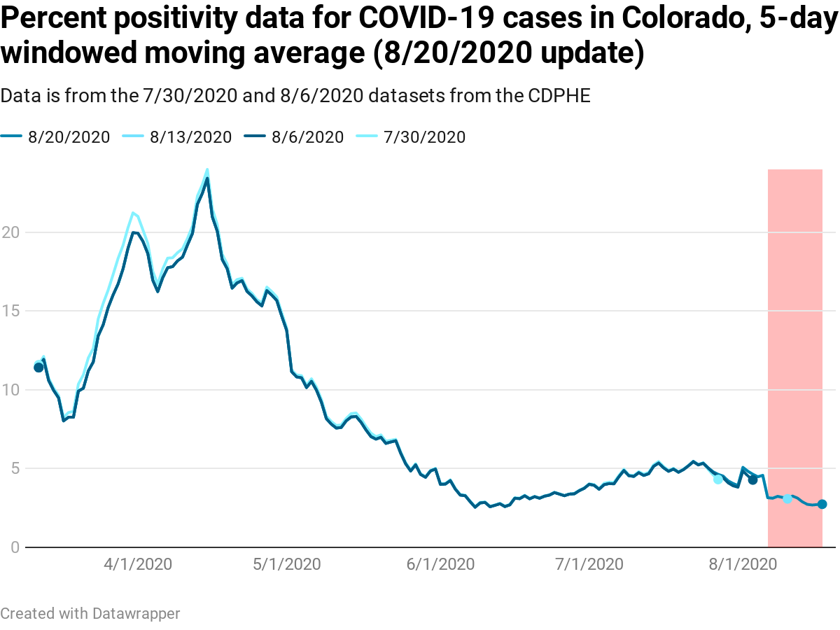
First, as with all medical tests there both are false positives (people who do not have the virus but the test says they do) and false negatives (people who have virus but the test says they don’t). The fewer tests there are, the more likely these effects will distort the ratio. Second, when there are very few tests, dividing by the total number of tests can create the appearance of a large percentage when the actual percentage may not be that high.
So while I would guess that the recent slow upward trend from June to July was probably less than the data in March, April, and May, I’m not convinced that the percentage is as much less as the percent positivity data would seem to lead us to believe. That said, I’m not sure how to correct for that yet. It may take years and someone’s PhD thesis to figure it out.
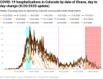
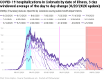
New hospitalizations by date of illness onset have also been falling recently. This is even better news than the new cases and the positivity percentage because it means that fewer people will be dying of COVID-19. Lots of people use new hospitalizations as a metric for how the pandemic is actually progressing instead of cases, and so when new hospitalizations decline, that means the pandemic is largely staying under control.
The problem with the new hospitalization data, at least for the data that is by date of new illness onset, is that it is subject to extensive revision, and that extends the effective lag time greatly. The lag in the new hospitalizations by date of illness onset is currently up to 34 days, which pushes the period of high variability back to before when Polis issued his mask order. And if you look closely at the data, you can see that there are still significant changes going on back that far.
Every week I look at the new deaths by date of illness onset and the hump of new deaths back in June continues to grow. This is because there is a 21 day average lag from onset of illness until death, and there’s a long lag (up to 39 days) between death and when this set of data settles down to within 20% of its final value. That’s a combined 60 days of lag, and that reaches all the way back to June 15 at this point. June 15 is very close to the low point of the new cases and new hospitalizations by date of illness onset and right as both started to climb.
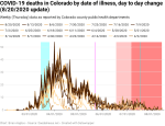
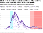
That means most of the deaths we’re seeing today are from people who showed symptoms up to two months ago. And it means that we’re going to continue to see the deaths hump upward for at least another three to 4 weeks. And worst of all – it means that we’re probably still looking at a bunch more deaths from the most recent hump.
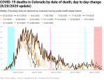
New deaths by date of death are up a little from their low point, but they’re still staying close to about five deaths per day (average). That sounds really good, and in the sense that it’s much lower than it used to be it is really good. But five new deaths per day is five families grieving. If you’re someone who cares more about the economy than people’s lives, then it’s five workplaces disrupted and, at the statistical average of a life, $50 million dollars lost to the Colorado and US economies over the course of their lives.
Here’s how 4.5 deaths per day compares to the leading causes of death in Colorado in 2017 (the last year for which the CDC has complete data available).
| CO Leading Causes of Death, 2017 | Deaths | Average Deaths/Day | Notes |
|---|---|---|---|
| 1. Cancer | 7,829 | 21.4 | |
| 2. Heart Disease | 7,060 | 19.3 | |
| 3. Accidents | 3,037 | 8.3 | |
| 4. Chronic Lower Respiratory Diseases | 2,604 | 7.1 | |
| 5. Stroke | 1,988 | 5.4 | |
| – COVID-19 as of 8/21/2020 | 1,889 | 4.5 | Approximate since July 8, 2020 |
| 6. Alzheimer’s Disease | 1,830 | 5.0 | |
| 7. Suicide | 1,181 | 3.2 | |
| 8. Diabetes | 1,017 | 2.8 | |
| 9. Chronic Liver Disease/Cirrhosis | 865 | 2.4 | |
| 10. Influenza/Pneumonia | 577 | 1.6 |
As of August 23, the total deaths from COVID-19 put it between strokes and Alzheimer’s Disease, and would make it the sixth leading cause of deaths in Colorado. Going by the rate of deaths since approximately July 8, and compared to the average rate of deaths of the other major causes of death in 2017, COVID-19 would be the seventh leading cause of death, just below Alzheimer’s and above diabetes.
And influenza/pneumonia, which is the leading cause of deaths due to infections and the only infections that break into the top 10, would be shoved off the list entirely by COVID-19.
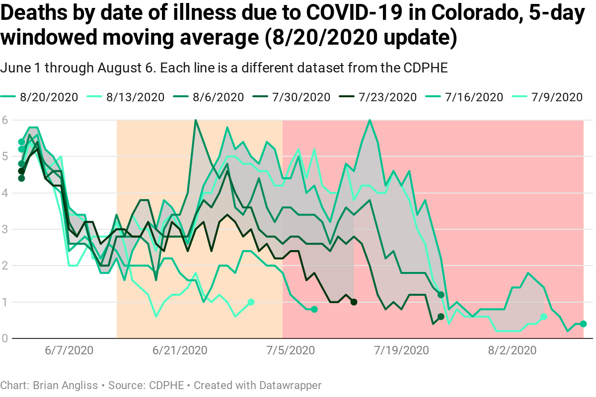
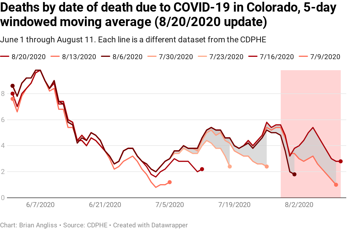
I’ve plotted the comparison of deaths by date of illness to deaths by date of death since June 1 at the right (top: by date of illness onset. Bottom: by date of death). I started tracking this metric a month ago in order to show clearly how deaths today reflect back to increases in the past, and every week the hump back in late June and July has continued to grow. This is exactly what we would expect to see given the (currently) 21 day lag between showing symptoms and death and the significant number of updates from hospitals that result in 39 days of high variability in the death totals (by date of illness onset). The orange and red shaded regions are a combined 60 days of high variability.
And again, the deaths by date of death are much better known and take much less time to stabilize.
As an analysis note, my previous analyses of the deaths by date of death started after the total number of deaths exceeded 10 but then continued to the last date of the data. This approach essentially biased the data toward recent periods (which isn’t necessarily a problem given we’re more interested in recent trends) but resulted in a shifting acceptance criteria of the data as I needed 10 deaths per day to start using the data but could have as few as zero deaths once I’d started. Instead, I applied the same metric on when I stopped tracking data. This biases the data back to earlier in the pandemic when there were more deaths, which is unfortunate. But the point of requiring a minimum of 10 deaths was to reduce the impact of changes when the total was also small. When you’ve got two deaths total, an increase in one is a 50% increase, and my stability metric is being within 20% of the final value.
I might someday lower the threshold to something like 7 or 8, but I won’t ever lower it to 5 or lower since that’s the point at which a single death can have a dramatic effect on my calculations. My plan is to update the methodology across all my analyses over the next week or two.
One final note about deaths from COVID-19. Because there is up to two weeks of lag in reporting COVID-19 deaths to the state, anyone who is claiming that new deaths are down based on data in the last day or two is incorrect. There’s no way to know if new deaths are down or not until days have passed.
—
All in all, there are some good signs in the data. New cases and positivity percentage are down, new hospitalizations are down, and deaths are holding relatively steady at a rate that is too high, but not so bad that it can’t be managed and planned for. So what we’ve been doing since July seems to have been working.
That said, schools are reopening across Colorado, and we’re already seeing cohorts (sub-groups of students in a grade/school taking the same classes with the same teachers), grades, teachers coming down with COVID-19 and forcing quarantines on students and, in at least one case, an entire school – all within the first week of in-person classes for the respective schools, so I’m anticipating the course of the disease will get worse from here.
And frankly, anyone who is surprised by this has never suffered a child-transmitted cold or pink eye that the kid brought home from school.
Again, I’d like to add my usual caveat here. I’m not an epidemiologist or infectious disease or other public health expert, just an engineer who has been tracking the progress of COVID-19 in Colorado using CDPHE data since April. If anything I say is contradicted by authentic experts, listen to them over me.

Leave a comment