 The rate of new cases in Colorado is increasing again. New hospitalizations are flat and expected to start increasing again. Deaths are presently and thankfully few compared to even a month ago, but will start climbing when hospitalizations increase.
Bad things are on the horizon because too few people are being responsible, either because of their ideology or because they’re young and think they’re invincible. And we’re not even to the second wave yet.
Before I dive into the various graphs individually, let’s look at the graphs in general.
Since my last COVID-19 assessment, I’ve added two more highlighted dates and two date ranges. The red and orange lines remain the April 19, 2020 anti-lockdown protests in Denver and the day that Governor Polis relaxed the statewide stay-at-home order (although many counties continued to impose stay-at-home orders that expired a couple of weeks later). The blue line is Mother’s Day, the magenta line is the end of school for most children across colorado, and the yellow date ranges are the George Floyd/Black Lives Matter (BLM) protests that have been happening in Colorado.
I added the Mother’s Day marker because it’s traditionally a day when families go out to dinner so Mom doesn’t have to cook and because there was at least one restaurant that opened up with no social distancing or mask protections required. I added the end of school because we’ll start to see families travel more and interact more with each other over the summer months. And I added the protests because, while protesters in Colorado have been good about wearing masks and distancing, these are still massive gatherings of people that have gone on for weeks. Add counter-protesters and police who have been less likely to be wearing masks than the protesters and the protests might create the conditions for COVID-19 to spread more easily.
Also, since it’s been a month and there has been stuff happening, I added back the raw day-to-day change in new cases, hospitalizations, and deaths as well as the 3-day windowed moving average.
With that out of the way, let’s look at the details.
New COVID-19 cases in Colorado, by day of illness onset
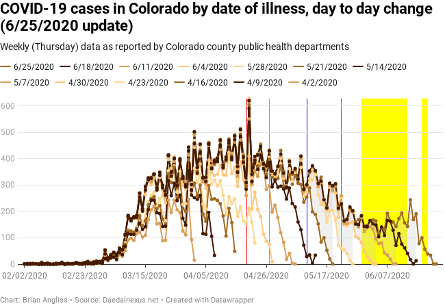
Let’s start by looking at the general shape of the new cases per day curves. We can clearly see the pre-exponential growth period (before about February 23), the exponential growth period (February 23 to March 18 or so), the linear growth period after Polis imposed his various anti-COVID measures (March 18 to April 22 or so), and then a slow period of declining cases (April 22 to May 13). There’s a second period of faster decline cases from (May 13 to June 4), followed by the most striking feature of the new cases per day curve – the increase in new cases per day since June 4.
This is bad. We’ll look at this a bit more closely later.
I don’t have a lot to say about what we can learn from the raw data this time, because I think I’ve said it all before. The main thing is that we continue to see small adjustments throughout the entire dataset, but they’re fewer than ten cases and usually only one or two. The daily peak hasn’t moved from April 20 in over a month. And it’s taking 3-4 weeks for the data to largely stabilize in the new cases day-to-day. This is part of why I’m using the windowed average filters.
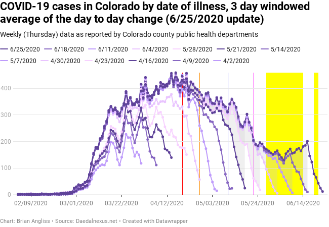
We see a new feature in the 3-day windowed average graph. There was a large jump in cases that went all the way back to April 22 between the 5/28 and 6/4 datasets. And we can see that the number of new cases started having a sustained increase in last week’s dataset, and that the increase started around June 5. We also see very clearly (one might even say obviously) from the sharp turnaround in the most recent (6/25) dataset that we cannot trust the new cases per day data at all until about 10 days later. That means that today’s new cases data won’t be even remotely meaningful until July 7 at the earliest.
We cannot trust the new cases per day data at all until about 10 days later.
According to Governor Polis, the cases are partially but not completely related to the BLM protests. This should not surprise anyone as social distancing has not always been observed and, while protesters have usually been masked, counter-protesters are far less likely to be masked. In addition, while there is evidence that being outdoors is much less risky than indoors, hundreds or thousands of people in a single area will always increase the risk of transmission.
Another source of new cases in Colorado was college party houses in Boulder. Basically, students came back to the neighborhood known as “The Hill” and started having large parties, and COVID-19 flared up. Because young people who are not known for making wise choices to start with, alcohol, crowds where social distancing is impossible, and being indoors is about the perfect recipe for COVID-19 spread.
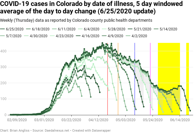
Looking at the 5-day windowed average graph, we can look for bumps from the various highlighted days. There is a small bump in the data at about six days after the anti-lockdown protests, peaking on April 25, but it’s small enough that it could be noise in the data. It will probably take an epidemiologist to determine if that bump was truly associated with the protests or not. There’s a spike in cases on May 6 that might be related to the first weekend after the stay-at-home order expired, but again, it’s not large enough that a quick visual analysis can tell us much.
There is a small bump three days after Mother’s Day, but that’s generally too early for COVID symptoms to appear, so it’s not likely related. The slowing in the rate of decrease in new cases that starts around May 24 (as schools were letting out around the state) could be related to the end of the school year. Frankly, some of the increase over the last few weeks is probably related to the end of school and more people traveling.
It’s not all returning college students and it’s not all related to the BLM protests. But it’s not good, and I hope that the Governor has the political will to lock the state down again if it looks like that will become necessary.
New COVID-19 hospitalizations in Colorado, by day of illness onset
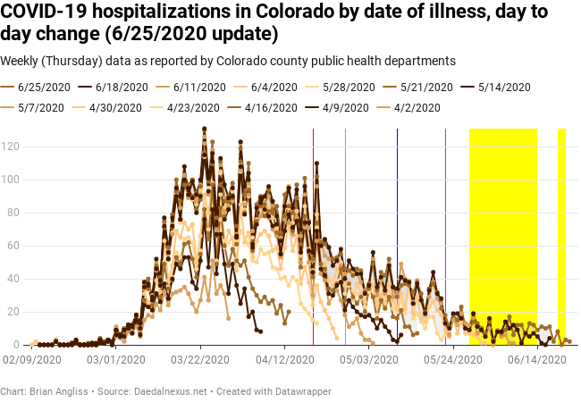
It’s quite difficult to make many conclusions simply by looking at the raw data for new hospitalizations per day. It’s noisy and while there are different domains in the data (exponential growth period, et al), it’s far easier to understand any trends in the hospitalization data by looking at the windowed average data. Still, it does look like we’ve likely hit the low point in new hospitalizations per day and it’s around 10. That’s not bad, and I suspect that hospitals could handle that for a long time if it was stable.
Unfortunately, the increase in new cases per day will mean an increase in the number of new hospitalizations eventually. The question is when, and whether we’re already seeing that in the hospitalizations data.
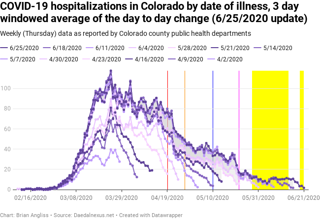
Looking at the 3-day windowed average graph, there’s no question that the number of new hospitalizations per day has stabilized at about 10 since June 5. This is the same day that new cases hit their minimum and then started growing again. Keep in mind that this is the hospitalizations by date of illness, just like the number of cases above is by date of illness, and so there should be correlations between the two datasets.
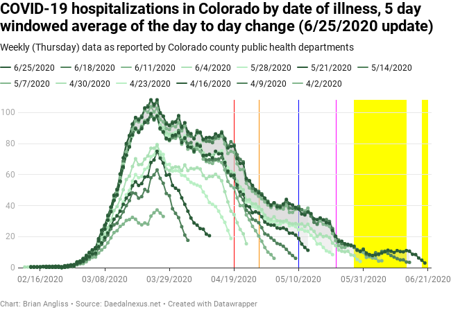
There also appears to be a large increase in the number of hospitalizations per day between the 6/4 and 6/11 datasets, but the gap wasn’t really visible in the raw data. But it shows up very clearly in the 5-day windowed average data. So clearly, in fact, that it’s the first thing I notice about the graph. The increase between the 6/4 and 6/11 datasets goes all the way back to March 18. I haven’t dug into the details, but it looks like there was either a change in methodology in tracking hospitalizations or there was an outbreak discovered that hadn’t previously been attributed to COVID-19. Let’s look at what the increase did to the various regions of data.
- Pre-exponential growth period (up to February 23): no changes, probably because there were so few cases and hospitalizations that methodology changes won’t do much.
- Exponential growth period (February 23 to March 18): Minimal changes, but I’m not sure why. Maybe because the rate of growth in hospitalizations is so fast that it’s hard to see them?
- Gradual decline period (March 18 to April 19): As soon as the number of new cases stopped being exponential and slowed to growing at a linear rate, the number of new hospitalizations went from growing exponentially to decreasing more or less linearly. The data update flattened this area some, but didn’t really change either its beginning or end points.
- Quicker decline and first (?) stabilization plateau (April 19 to May 13): Over this period we see an initial sharp decline in hospitalizations followed by a relatively flat area of between 35 and 40 (averaged) new hospitalizations per day. The data adjustment reduced the rate of decline in the early portion of this period and resulted in a much flatter, stabile period that is also about new hospitalizations higher than the data was before the adjustment.
A couple more comments before we move on. First, we should be able to use the data in the gradual decline period to estimate the growth rate in cases above which hospitalizations continue to increase instead of decrease. I haven’t had time to do this yet, but I’d bet that the state (and national, and international) epidemiologists have.
Second, while the number of new hospitalizations were essentially flat and probably manageable for the last couple of weeks, if the number of cases per day continues to rise or even accelerates, Colorado hospitals will find themselves right back where they were in April.
If I were a hospital administrator, I’d be a) demanding that county and state public health departments tell everyone to social distance and wear masks all the time and b) increase my stockpiles of personal protective equipment even more than I already had in preparation for the next wave. Because this isn’t the next wave, this is what happens when the first wave isn’t taken seriously and surges back again.
New COVID-19 deaths in Colorado, by day of illness onset

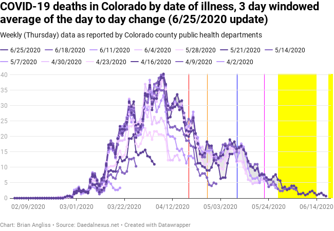
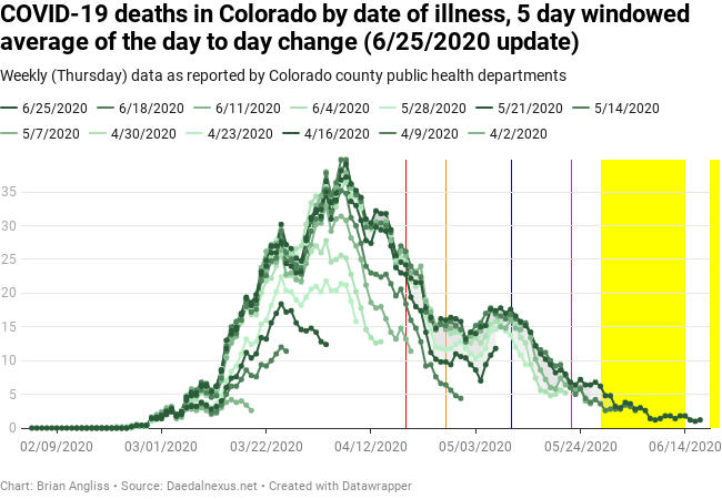
I keep tracking the number of new deaths by date of illness because I keep hoping it’ll tell me something, but its shape is so strange that I’m still struggling to truly understand it. This is especially true of the raw data, which is just as noisy as the new hospitalizations data, but because the total number of deaths is lower, the noise is visually larger and even more confusing.
Still, there are some observations we can make from the data. For example, the data adjustment that affected hospitalizations per day did not affect the new deaths per day by date of illness onset. The following observations are all from the 3-day and 5-day windowed average graphs.
We also see that the deaths by date of illness onset lag both cases and hospitalizations, as we’d expect. In fact, the peak in deaths isn’t until April 6, which is well after the number of new cases per day had transitioned from exponential growth to linear growth. This is also nearly two weeks into the decline in hospitalizations.
This does roughly correspond to the point at which hospitals were reporting being the most stressed by the total number of patients, however, so it wouldn’t be a surprise if the peak in deaths was more closely related to the ability of Colorado’s hospitals to handle the flood of patients. This speculation is supported by the fact that the number of deaths dropped briefly (but sharply) about a week after Polis locked down the state, which is a reasonable point at which we’d expect to see the first decrease in deaths per day. Then as the sheer numbers of patients stressed the system, deaths climbed again.
This data should help inform experts as to what the stress point of Colorado’s hospitals was and help hospitals improve their response to the recent increases in COVID-19.
After peaking on April 6, the number of deaths drops significantly until April 22, after which there’s a dramatic fall that then roughly stabilizes between 14 and 17 deaths per day. I would guess that the drop in deaths corresponds to both improvements in access to whatever materials were stressing hospitals and the number of new cases and hospitalizations falling below a critical threshold. Again, experts should be able to tell us more in the coming weeks and months.
Since about May 10 the data shows a slower decline to more like two deaths per day, but the data is new enough it’s tough to be sure. And with the recent rise in cases and what may become a similar rise in hospitalizations, we can probably expect that the number of deaths will start increasing as well. The lag from contracting COVID-19 to being hospitalized for it to dying of it is weeks, however, so we shouldn’t expect anything significant until the 7/2 or even 7/9 datasets.
New COVID-19 deaths in Colorado, by day of death
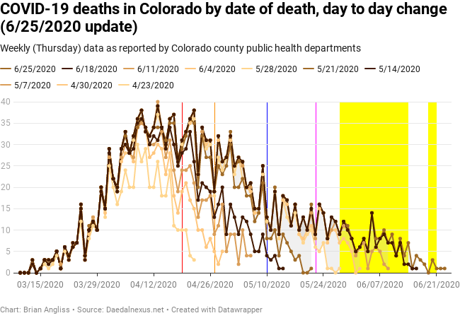

The graph of new deaths per day by date of death (as opposed to by date of illness onset above) is very similar in shape to the graph of new hospitalizations. These graphs have the same basic features – exponential rise, flattening out, peaking, and then two regions of decline (at different rates). The main difference is that the deaths by date of death is delayed by 2-3 weeks and the numbers are much smaller because (thankfully) not everyone who goes into the hospital with COVID-19 dies.
We still see large changes in the data in the first 7-10 days that make the data essentially unusable for a full week. We see some periods where there are some significant adjustments that don’t seem to persist, suggesting that data errors were being discovered and corrected (for example, misattributing data for one week to a different week).
In the 3-day windowed average graph, we see a hump in the data 10-12 days after the April 19 anti-lockdown protests that could be related to the protests. The timing is about right, and there is a spike in the 5-day windowed average graph on April 30, but we literally can’t attribute the hump/spike to the protests. It’s suggestive, nothing more.
Similarly, we see the decline in the number of deaths per day slow down on around May 10, which is about two weeks after Governor Polis relaxed his stay-at-home order to a safer-at-home order. That doesn’t mean they’re connected, but the data indicates that there could be a correlation that is also causative. But again, we can’t say.
We can say that there doesn’t appear to be any humps or spike in the data that occur following the Mother’s Day holiday that exceed the background noise of even the 3-day and 5-day windowed average filtering. Yes, there’s a small bump on May 22nd, but it’s well within the expected amount of variability. Given this, we’re probably safe to conclude that there was no wider spread of COVID-19 associated with Mother’s Day. At least, not so much that the number of deaths per day were noticeably affected.
There is a large dip and large increase in the number of deaths per day by date of death on June 2 and June 7th respectively, but I don’t know of anything that would clearly correlate with either. I can say that neither is associated with the BLM protests, however, as any deaths from contact during the protests should only start showing up now due to the inherent lags from contracting the virus to showing symptoms to being hospitalized for it to dying from it.
Time will tell.
—
The changes in the data over the last month also show that pandemic is most assuredly not over.
So let’s summarize. New COVID-19 cases are increasing again, and primarily among late teens and early twentysomethings (whose brains tend to be wired for reward over risk). There are indications that the anti-lockdown protests might have created bumps in cases, indications that Polis’ relaxation of the statewide lockdown slowed the decline in all the COVID-19 metrics (new cases, new hospitalizations, and new deaths), and indications that the BLM protests have spread COVID-19 some (but probably not as much as indoor gatherings).
We also see that, just as the experts have been telling us for months now, hospitalizations are the best indicator of what’s going on with the pandemic. Data on the number of people entering the hospital for COVID-19 are more accurate than the data on new cases and the more people enter the hospital, the more deaths there will be. So if we see the number of hospitalizations start to climb, we know we have a problem no matter what the other data is telling us.
The changes in the data over the last month also show that pandemic is most assuredly not over. We’re living through COVID-19 version 1.5 right now, and version 2.0 is still expected in the fall. And as always, the data lags reality, so wear your masks, social distance even outdoors, and avoid large indoor gatherings. Most importantly, listen to the actual honest-to-the-gods experts (and no, Donald is not an expert).
Finally, don’t forget to contact the Governor, mayors, and local law enforcement and remind them to have a spine if it becomes clear that it’s time to reimpose lockdowns.

Leave a comment