It’s been a month since my last update on COVID-19 in Colorado, so let’s see what’s changed.
I’ve made a few updates to the graphs below. I’m now going to only track the last 12 (or so) weeks of data unless there is something specific in the earlier data that I need to compare against. The graphs had so many different lines in them it was getting hard to understand them.
I’ve also added the yellow highlighted time period which is from August 10 to September 7, which is the period between when the first Colorado schools went back into session to right before nearly all Colorado schools went back into session. If schools lead to an increase in new COVID-19 cases, hospitalizations, and deaths, we would expect the data to show an increase in this period and to increase significantly following it.
As a reminder, the red highlighted region is the time period that the data is unstable (defined as not yet within 20% of it’s final value), the cyan line is when Governor Jared Polis instituted a statewide mask mandate, the magenta line is the last day of school for most school districts in Colorado, and the cyan highlighted region is when Polis ordered the stay-at-home order and closed down large public gatherings across the state in March.
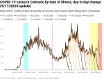
Now, let’s look at the new cases data.
There is no question that there has been an increase in new cases since schools went back into session. There was an almost immediate jump in early August as teachers were forced to return to school prior to students, and new cases stayed reasonably stable during the period where most large schools were on remote learning. But with the return of schools to in-person and hybrid learning, the number of new cases per day has grown significantly.
A note of caution, however – due to the time it takes the new cases data to stabilize, we should assume that anything in the red region is going to show further increases. And given most of the increase since the return to school is still in the red region, the numbers are going to get worse.

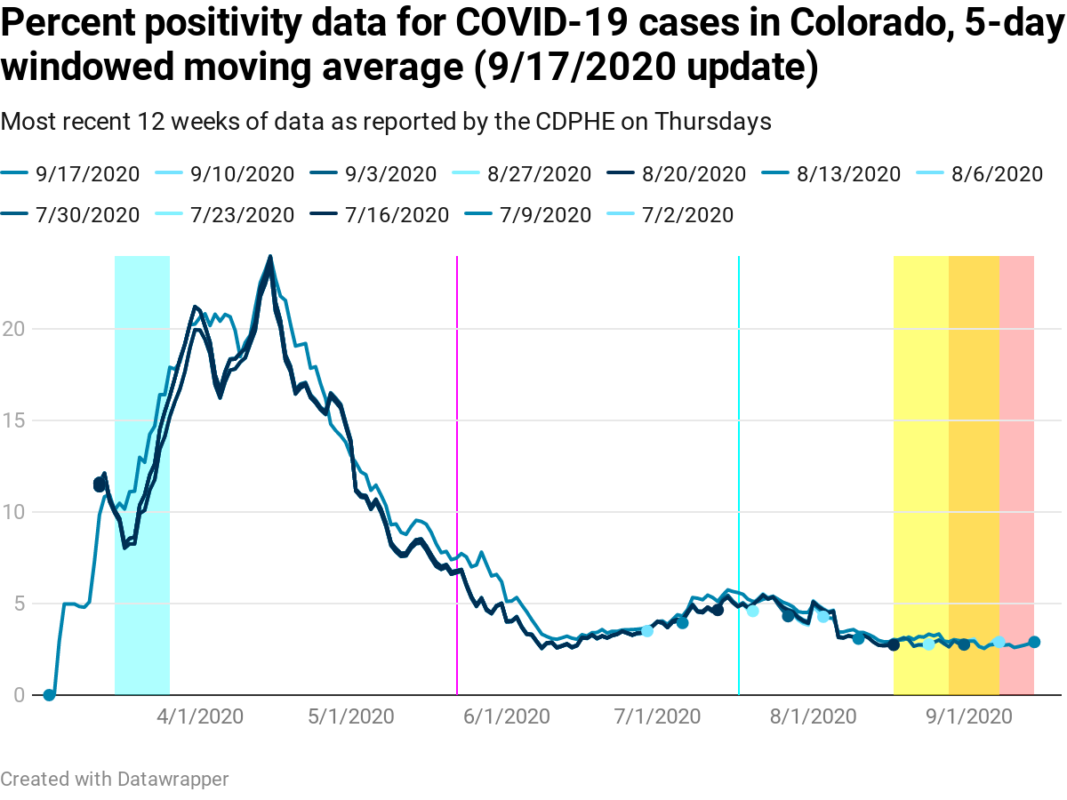
If you’re more interested in the positivity percentage data than the number of new cases (which I totally understand), then we can look at that as well. In this case there was a significant update in the last week that largely affected positivity percentages in the first few months of the pandemic and that pushed the test starting date back about a week.
The major impact of the change was to show that the positivity data is not as stable as I had previously estimated. And as a result, there is now a red instability region that is up to 18 days long. That’s nearly three weeks for positivity to stabilize. The changes were significant enough all the way back into May that I couldn’t even use the most recent data to estimate the stability period. This should settle down some in coming weeks (the data seems to be subject to infrequent significant updates like this), but for the moment it’s a problem.
What the data shows is that there may be a small increase in positivity percentage in the early period after schools went back into session. It’s well within the noise, however, and because the stability period is 18 days, we should expect the positivity percentage to vary quite a bit for several more weeks before we can make good conclusions off it.
So anyone who is claiming that the positivity percentage data shows we can reopen the state complete, or even just school, isn’t following what the data shows at this time. And with lives literally on the line, caution is warranted.
It’s also important to note that what we know about COVID-19 suggests that we may well see an increase in cases before we see an increase in test positivity percentage. The reason is that school-age kids don’t show symptoms like adults and older teens do, and so they’re less likely to be identified as needing a test in the first place. In addition, larger behavioral changes (namely the fact that the statewide mandatory mask order is still in place and positivity had dropped as a result) might be momentarily concealing the increase due to schools.
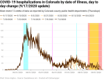
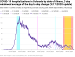
New hospitalizations per day appear to be reasonably stable for the moment. There may be signs of an increase associated with schools going back into session, but the increase is all in the 34-day long instability period, so it’s really much too early to say. We should start getting better data on this soon. But if the new cases data is correct, then the new hospitalizations will increase eventually as well. And there is a small increase in the new hospitalizations data that might turn out to be more as we proceed through the instability period.
Time will tell.

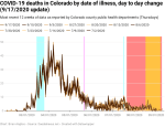
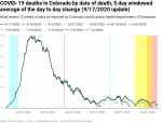
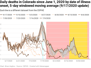
New deaths by date of illness have a 51-day instability period, so it’ll be a while yet before we can say for sure that new deaths have changed in response to school going back into session. But the data shows that there was a significant drop in new deaths immediately after Polis issued his statewide mandatory mask order, and that drop is now emerging from the instability period. There are also indications of an increase in recent weeks, but it’s so recent that it’s too early to say if it’s a) real or b) associated with schools or something else.
As with the new hospitalizations, time will tell.
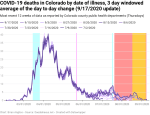

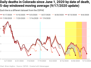
New deaths by date of death, which shows a very high correlation with new hospitalizations by date of illness, but delayed by about three weeks, are remaining low. However, as new hospitalizations increase, new deaths will increase as well. The three week delay is a result of the fact that COVID-19 cases take about three weeks to go from being serious enough to need hospitalization to death (for patients who eventually die).
So we’ll see an increase in new deaths by date of death from school going back into session about three weeks after we see an increase in new hospitalizations. Given there might be a small increase in new hospitalizations in the last couple of weeks, we would expect to see a corresponding small increase in new deaths by date of death in the next couple of weeks.
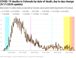

Finally, let’s again look at the deaths by date of illness and the deaths by date of death since June 1, 2020.
I’d like to focus on the gray regions on both graphs, as they show how the instability period actually works. We can see that the gray periods in the deaths by date of death go far back in time, in some cases all the way back to early June, but that the farther back in time you look, the narrower the gray band is. This is because the gray band is the difference between the most recent dataset (9/17/2020) and the previous five datasets. So it represents the updates to the data that have happened in the last five weeks.
Looking at the gray period in the new deaths by date of death shows that they persist for only a short period of time between each dataset. That shows that the data stabilizes much more quickly for this dataset than it does for the other.
In the next few weeks I expect to hear a lot about schools closing down due to quarantine. It’s already happened to one entire school in Jefferson County that I know of, and with how contagious COVID-19 is, it will almost certainly happen more often. And I expect to see that in the data, unfortunately.

Leave a comment