
The policy of backdating and revising previous COVID-19 data means that we have a better picture of what the virus is doing in Colorado, but it also means that we shouldn’t base any decisions on the data from the last week and data from two weeks ago should be treated as questionable at best.
In my latest Colorado COVID-19 post, I wrote that I’d discovered that the Colorado Department of Public Health and Environment (CDPHE)’s policy of backdating cases, hospitalizations, and deaths made the data very noisy and thus the Governor’s plan to relax the stay-at-home order was questionable. I also said I’d be studying the ramifications of the noisy data in the coming days.
I’ve since spent some time looking at those ramifications, and here the are in a nutshell:
- While the peak cases was on March 30, backdating data means we can’t be sure that’s right. But it does look likely that we have either passed peak cases or will be very shortly.
- While the peak hospitalizations was on March 25, backdating makes this questionable too. So too does the fact that hospitalizations should lag cases, not lead them. As with cases, though, it looks likely that we have either just recently passed peak hospitalizations or will soon.
- While the peak deaths was also on March 25, recent data shows no significant downward trend and several recent spikes that could easily be larger than the 3/25 peak once we’ve gone a few more weeks of backdating. Given deaths should lag hospitalizations by 7-10 days, it’s almost certainly true that we have not reached peak deaths in Colorado.
Given this information, it is too soon to relax the stay-at-home order to “safer-at-home” with the attending relaxation of social distancing and reopening of nonessential businesses.
Now, for the details.
COVID-19 cases in Colorado
[Note: see the methodology section below for details on what I did and how.]
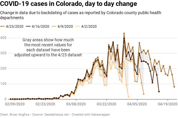
At right we see three graphs – the increase in the raw number of COVID-19 cases on a day-by-day basis (top), the same data with a 3 sample window filter applied (middle), and then the same data with a 5 simple window applied (bottom). From the top image, we can see that the peak number of cases occurred back on March 30. We also see that there is some structure to the data – the big peaks and troughs appear on roughly weekly intervals, for example.
But we also notice that the last day of the dataset – April 2 for the 4/2/2020 dataset (orange), for example – is always much lower than it is the following week, or two weeks later, or three weeks later. This means that the data is only relatively accurate for days or even weeks in the past. And we can see that by looking at the differences between data for 4/2 in each of the datasets. On 4/2, there were only 15 new cases reported for 4/1. But on 4/9, counties had updated their cases and the number of cases had risen to 252. By 4/16, the corrections had added another 55 cases, to a total of 307 cases, and by 4/23, corrections had brought up the total number of cases to 363.
And finally, we notice that the farther back in time from the date of the dataset, the fewer corrections there are. If you look at the datapoints for 3/16 in each of the three datasets, you’ll see that the difference between the 4/2 and the 4/9 datasets is 38 cases, the difference between the 4/9 and the 4/16 datasets is 18 cases, and the difference between the 4/16 and the 4/23 datasets is 12 cases.
Overall, what this means is that the CDPHE data is subject to significant revision for the first week or two, and the most recent data is the most subject to revision. And if we’re looking to determine when we’ve passed the peak of new COVID-19 cases in Colorado, all those revisions are equivalent to noise that make it hard to distinguish the real peak. Those revisions also mean that we won’t be sure we’re past the peak for at least a week, probably two, and maybe as many as three weeks after we’ve passed it.
And that’s without the structure of the data making it harder to see too. Thankfully, we can use some simple averaging to help filter out the spikes and see the real signal.
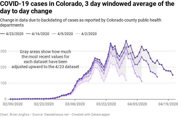
The 3 day windowed average data changes the data and highlights some different information than the raw data does, and it takes out some of the day-to-day noise. What it doesn’t do, and can’t do, is remove the backdating revision noise.
Using a 3 day average changes the date of the peak number of hospitalizations from March 30 for the raw data to March 31. We still see the weekly structure, but it’s less pronounced as we would expect (that’s the point of filtering like this – to smooth out the fast noise in order to better see the slow signal).
We still see massive changes in the latest data for each dataset. Partly this is because the filter ends up putting the last data point directly on top of the weekly spike, so instead of looking at the last datapoint, let’s look at the second to last. If we look at the data for March 30 from the 4/2 dataset (150 cases), we see that the adjustments in the following three weeks increases the number of cases significantly, to 322 cases in the 4/23 dataset. We see a massive increase in the two weeks of revisions between the 4/9 and 4/23 datasets (138 to 293 cases on April 7), and a smaller increase in the one week of revisions between the 4/16 and the 4/23 datasets (159 to 225 on April 13).
Finally, with a 3-day window filter, we see more clearly that the further back in time from today, the less significant the adjustments are. It’s just easier to see that there are large magnitude changes between datasets that are one week apart, smaller magnitude changes in the second week, and the smallest changes in the third week.
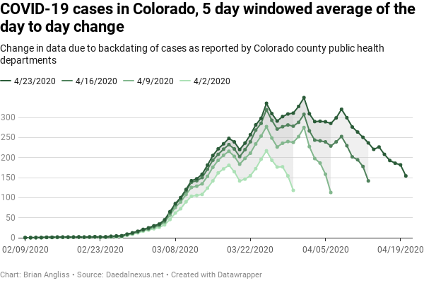
We can broaden the averaging filter from 3 days to 5 days to see if we learn anything new, and for the COVID-19 cases data, we really don’t. We still have the same weekly structure, we still see the big differences between early points in the datasets, and we still see the same degree of revisions from week to week. The peak does move forward by another day, to April 1, but that’s about it.
COVID-19 hospitalizations in Colorado
[Note: see the methodology section below for details on what I did and how.]
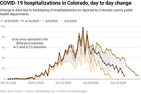
At right we see three graphs – the increase in the raw number of COVID-19 hospitalizations on a day-by-day basis (top), the same data with a 3 sample window filter applied (middle), and then the same data with a 5 simple window applied (bottom). From the top image, we can see that the peak number of hospitalizations occurred back on March 25. We also see that there seems to some structure to the data. Oddly, the structure this time doesn’t fall neatly on weekly boundaries – it appears to be roughly every 6 days instead of every 7 days.
As with the data on cases above, we notice that there is the same problem with recent days (referenced to the date of the dataset) being wildly wrong and updated upward massively over the following weeks. For the March 31 data, it starts at 15 hospitalizations on 4/2, increases to 36 hospitalizations by 4/9, to 51 hospitalizations by 4/16, and to 52 hospitalizations by 4/23.
And we notice that the farther back in time from the date of the dataset, the fewer corrections there are to the hospitalization data. If you look at the datapoints for 3/16 in each of the three datasets, you’ll see that the difference between the 4/2 and the 4/9 datasets is 17 hospitalizations, the difference between the 4/9 and the 4/16 datasets is 4 hospitalizations, and the difference between the 4/16 and the 4/23 datasets is 3 hospitalizations. We first observed this behavior on the COVID-19 cases data above, and we see it here in the hospitalization data as well.
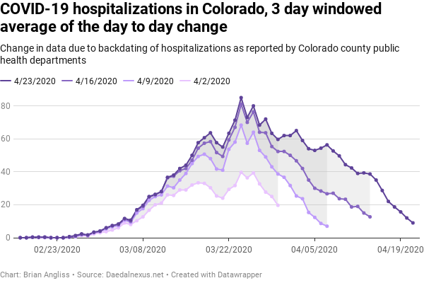
When we look at the 3 day windowed average, we see that the peak number of cases shifts from March 25 for the raw data to March 24. The structure is largely still there, but it appears to be more like every 5 days, and as expected, the magnitude of the peaks and troughs are much diminished. That’s the point of filtering out the noise, after all.
We still see massive changes for the most recent data in each dataset, but unlike the cases data where there was overlap between low recent data and weekly spikes that created the appearance of unusually large differences, there is less of that with the hospitalization data. The data for March 30 increases from 20 hospitalizations in the 4/2 dataset to 60 hospitalizations in the 4/23 dataset. We that the data for April 7 increases from 7 hospitalizations to 56 hospitalizations in the 4/23 dataset. And we see that the data for April 14 increases from 13 hospitalizations to 29 hospitalizations in the 4/23 dataset
As with the number of COVID-19 cases, we see from the 3-day window averaged data that the further back in time from today, the less significant the adjustments are. But we see something in the hospitalization data that we didn’t see in the cases data – there appears to be a slowing in the rate of decrease since March 26 that creates a bulge in the most recent (4/23) dataset as compared to the other datasets.
This reduction in slope means that revisions to old data is reducing the rate at which hospitalizations are decreasing. Essentially, there are more hospitalizations attributed to COVID-19 than there used to be.
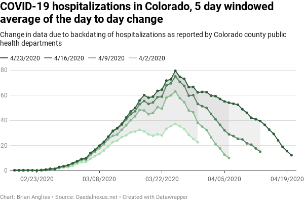
We can see this effect even more pronounced in the 5-day windowed average graph. As we would expect, the 5-day structure is nearly completely filtered out, but we now see that, while there were steep declines in the rate of hospitalizations in the 4/2, 4/9, and 4/16 datasets, the rate of decline in the 4/23 dataset is much slower. This suggests at least a couple of possibilities.
First, it’s possible that reporting of hospitalizations is simply as much as 3 weeks behind. Given the stress hospitals are under dealing with the infection, this is entirely possible and even likely.
Second, it’s possible that the peak on 3/25 isn’t actually going to turn out to be the peak for hospitalizations. This is related in part to not having timely data from hospitals, but it’s also supported by the fact that hospitalizations should lag total COVID-19 cases simply because people with COVID-19 don’t usually need to be hospitalized until days or weeks after they’ve been infected.
But because we know we don’t have good data (defined for our purposes as data that doesn’t change by more than a small amount due to backdating) for at least 2-3 weeks after it’s initially reported, we won’t know for sure for at least another week and probably more like two.
COVID-19 deaths in Colorado
[Note: see the methodology section below for details on what I did and how.]
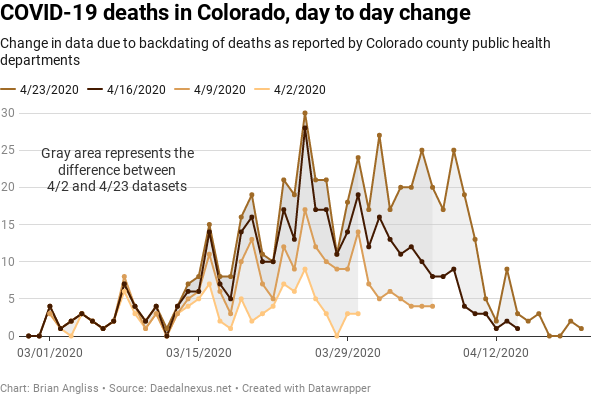
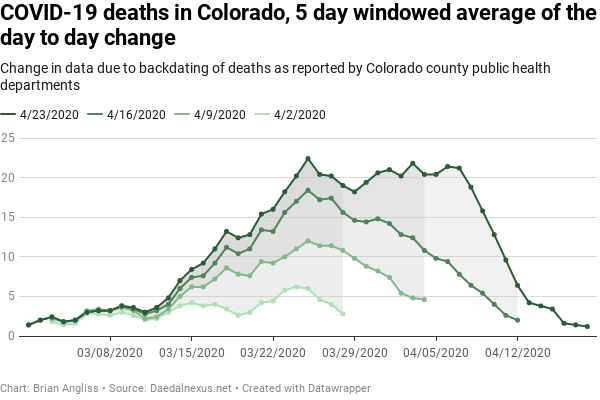
At right we see three graphs – the increase in the raw number of COVID-19 deaths on a day-by-day basis (top), the same data with a 3 sample window filter applied (middle), and then the same data with a 5 simple window applied (bottom). From the top image, we can see that the peak number of cases occurred back on March 25. We also see that, unlike the data on COVID-19 cases and hospitalizations above, there doesn’t seem to be obvious structure to the data. The peaks vary by as little as 2 days to as many as 5 days, with similar variations in the dips.
As with the COVID-19 cases and hospitalizations, we see in the deaths datasets that recent days (referenced to the date of the dataset) are always significantly revised upwards. The March 30 data is only 3 deaths in the 4/2 dataset, but increases to 14 deaths in the 4/9 dataset, 19 deaths in the 4/16 dataset, and 24 deaths in the 4/23 dataset.
And again, we notice that the older the data is, the fewer corrections there are in the deaths data.
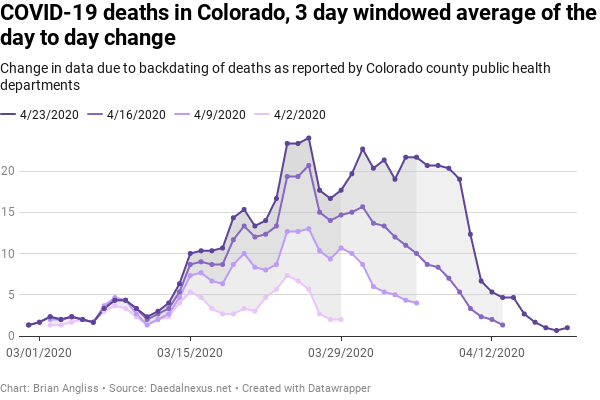
When we look at the 3 day windowed average, we see that the peak number of deaths shifts from March 25 for the raw data to March 26 for the 3 day average. The filtering reveals that there might actually be some structure to the data roughly every five days, just like the hospitalization data. But it’s less obvious in the deaths data.
The magnitude of the updates to the most recent data in each dataset is clearer in the filtered data than it is in the raw data. The number of deaths on March 29 increases from 2 in the 4/2 dataset to 11 in the 4/9 dataset, to 15 in the 4/16 dataset, and to 18 in the 4/23 dataset. The increase in April 5 data is even more significant going from the 4/9 dataset (4 deaths) to the 4/16 dataset (10 deaths) to the 4/23 dataset (22 deaths).
As with the number of COVID-19 cases and the hospitalizations, we see from the 3-day window averaged data that the further back in time from today, the less significant the adjustments are. But we see something in the deaths data that we only saw hints of in the hospitalization data – there is a significant slowing in the rate of decrease in the number of deaths each day.
This reduction in slope means that between the 4/16 and the 4/23 datasets, a lot of new deaths were unfortunately discovered in the period between March 30 and April 9. This is concerning because a lot more deaths means that we’re either experiencing a second bounce in infections or the apparently peak on March 26 isn’t the actual peak in number of deaths. And if we’re going to base public health decisions on that peak and the reduction in deaths since then, then we’re basing our decisions on the wrong data.
We can see this effect even more pronounced in the 5-day windowed average graph. Whatever structure there looked to be is gone entirely, suggesting that the 5 day structure that looked like it might be present in the 3-day windowed average was probably just an artifact of the windowing. And we see that the peak on March 25 (it shifted back to from March 26 using this filter) is only 1 death higher than the second highest peak on April 3, eight days later. And the third highest point is on April 6. It would take very few upward revisions between the 4/23 dataset and the 4/30 dataset next week (which I will add to the data I’m analyzing here) to move the peak deaths well into April.
Conclusions of all three sets of data
So let’s put this all together and assess what we’ve learned.
- We’ve learned that the revisions haven’t shifted the currently observed peak much – new COVID-19 cases peaked around March 30, while both hospitalizations and deaths peaked around March 25.
- We’ve learned that the curve for the number of COVID-19 cases is quite broad and that it has some weekly structure that we don’t understand the nature of.
- We’ve learned that the COVID-19 cases look to be occurring gradually and that the peak in cases is appears to happening after the peak in hospitalizations and deaths, and that the peak in deaths is very likely going to move forward as much as two weeks from March 25, where it was as of 4/23.
- We’ve learned that the raw data is really noisy both from day to day and due to backdated revisions issued with each new day’s dataset. This noisiness makes it difficult to determine when important events have actually happened, such as when the peak number of COVID-19 cases, hospitalizations, and deaths have each occurred.
- We’ve learned that we cannot trust the data from the last week at all because it will always be revised upward, and significantly. We can start trusting the data at about two weeks out, trust it even more at three, but it’s probably four to five weeks before we could really call the data “stable.”
- And we’ve learned that we absolutely, positively cannot rely on any data for the last day or two. It always creates a false impression that the number of cases, hospitalizations, and deaths are decreasing when, in reality, revisions will adjust the data so much that we don’t know.
Given everything we’ve learned, what can we say about using the data for statewide decisions?
First and most importantly, we cannot use the data for the last week as guidance for any decisions at all. It’s subject to too many revisions to be useful. The earliest data we should rely on – and even then only with great care – is from about 10 days prior to the day the decision is being made.
Second, there’s a really good chance that we’re not at the peak for either hospitalizations or deaths yet, simply because both of those should occur after the peak for COVID-19 cases. And the bulges we see in the 4/23 dataset as compared to the 4/16 or 4/9 datasets suggests that we’re likely to see this emerge from the noise in the next week or two.
Third, even if we assume that the data for total COVID-19 cases is correct when we know it’s not, it’s almost certainly too soon to relax stay-at-home orders and the shutdown of non-essential businesses. Which is what Governor Polis has done effective April 27. At least many county public health departments are maintaining their stay-at-home orders even as the Governor relaxes his.
In 1918, the city of Denver relaxed it’s Spanish Flu stay-at-home order in response to VE day, and as a result saw a spike in infections and deaths that was worse than the first one. If Polis gets his decision wrong, then the state of Colorado will see the exact same thing, but in a state that has many times the population. And the data we have available is clearly unreliable.
I am an electrical engineer, not an epidemiologist. But if I saw data like this in my job, I’d advise that we collect more data until we could make an informed decision. That is, fundamentally, the lowest risk approach with data that is so noisy and subject to revision as we have here. In my job, the risk is measured in days of lost schedule and dollars spent to repair damaged hardware. But with the COVID-19 data, the risk is measured in human lives.
I recognize that Governor Polis is stuck between a very nasty rock and a very hard place and that, as governor, it’s his job to navigate these very treacherous waters to the best of his ability. And his advisors are actually epidemiologists, not mere engineers reviewing the available data. But again, the risk of being wrong here will be measured in human lives.
Is one or two more weeks really that much harder than what we’ve already gone through?
Methodology details
Below are some details of my methodology, presented as a FAQ.
Why did you stop at the 4/2 dataset instead of going back another week to the 3/26 dataset?
I initially planned to go back to the 3/26 dataset, but when I opened it up I noticed that the hospitalization and deaths data was very sparse. In addition, since it was only 1 day past the peak in hospitalizations and deaths shown in later datasets, the data wasn’t going to be particularly meaningful even if it hadn’t been so sparse. I wanted to be able to draw meaningful comparisons between datasets for COVID-19 cases, hospitalizations, and deaths, and wouldn’t have been able to do so. So I stopped with the 4/2 dataset.
What are your windowed filters, and why don’t you have 2 or 4 samples?
I used 3-day and 5-day windowed filters. By using a window with an odd number of days, I can look forward and backward one day each (3-day window) or two days each (5-day window). This lets me get closer to the present than a moving average filter would (which takes the last N days of data and averages it). It is also why I can’t have even-numbered samples like I could with a moving average. There are other filter types I could have used instead, but this is what I went with for this analysis.
What do you mean that the structure you see in the COVD-19 cases might not be real?
There are any number of reasons why we might see a true 7-day periodic structure in a dataset. There could be reduced reporting on the weekends, for example, or outbreaks are more likely to occur a couple of days after reduced staffing (say on a Tuesday or Wednesday). But when you’re sampling the data every week like I did here, another possibility is that a 7-day periodic structure is a function of how you chose your data. In this case, it might have been better if I’d selected a 5 or 6 or 8 day difference between samples in order to make sure that the sampling day didn’t occur on the same day of the week. I may update this analysis at some future date to remove this possibility, but for now I’ll leave it unchanged.
