The second wave of COVID may – may – finally be weakening. Just in time for a post-holiday spike and schools to go back in session.
The last COVID update I made was back in November. I needed some time to recharge after the first semester and my job was keeping me quite busy. But now we’re into a new year and there is a lot to talk about in the data since my last update on November 19, 2020.
Before I dive into the details, let’s talk about some of the updates I’ve made.
Down at the bottom of the post you’ll find the legend for all the colored lines and highlighted regions in the figures below. Since November we’ve had two more major holidays and I’ve added those to the graphs as possible sources of infection.
Also, I’m considering replacing my 5-day moving windowed average with a 7-day average instead. This will filter out most of the reporting lags due to weekends and hospitals that report only weekly, but at the cost of losing some of the details. For the time being I plan to have both in my reports, if for no other reason than having a period of overlap between methodology changes is usually a good thing.
Finally, I’ve updated my methodology for calculating the data instability period (the red region in each graph) so that it’s less reliant on my own subjective judgement calls, has a more reliable mathematical basis, and is faster to update than the manual process I was using previously. Since the new methodology is an attempt to replicate my manual process using Excel formulas, the numbers aren’t a lot different. I’ll show what I mean in each section below.
And with that out of the way, let’s dig into the details
COVID timeline
In the process of debating COVID-hoaxers and the link on social media, I’ve realized that most people don’t have a good understanding of the timeline of a COVID-19 infection. So I’ve dug into the CDC and various scientific studies to come up with the timeline below.
- Time from contracting COVID to symptoms: 0-10 days, mean time is 5 days
- Time from showing symptoms (illness onset date) to needing to be hospitalized, if hospitalization is required: 8-14 days, mean time is 11 days
- Time from being hospitalized to death: 0 days to ~3 months, mean time is 22 days
Put together, this means that from the moment of exposure to death from COVID can be as short as 8 days, as long as four months, but will average around 38 days.
So why should we care? Because this timeline shows that infections occurring over holidays will kill people for weeks and even months afterward. It means that we have to be looking not at what was happening yesterday or even last week, but over a month ago to understand why deaths are as they are. And it means that the actions we take today will still be affecting lives months from now.
I’d like to think that, if people knew how long COVID can take, more people would be willing to do the things that are needed to protect each other. Not all, of course – I’m not that naive – but at least more.
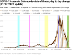
New cases per day by date of illness onset
The data clearly show that there was a period of exponential growth in new cases from about the second week of September through the second week of November. The peak in the 7-day windowed average data was on November 12, at 5267 new cases per day.
When I analyzed the data for the November 19 dataset, I said that cases were going to continue to get worse, but I was wrong. The reason I was wrong was because what would later be the peak was still within the instability period. So, essentially, I expected the trend to continue instead of reversing, simply because the data was too unstable to make a claim that it wouldn’t continue. This is something of a cautionary tale to not make too many projections based on data that has not yet stabilized, but given the cautionary principle, I’m not too worried about such an error.
I feel it’s important to recognize your mistakes, especially if the mistake points to ways to improve your projections in the future.
Unfortunately it’s not clear to me what happened in the days prior to November 12 to reverse the rise in new cases so significantly. I’m guessing it’s partly due to the gradual tightening of restrictions on restaurants, the imposition of curfews, and the like that were happening statewide at the time. But I haven’t been able to pin it down to anything specific, unfortunately.
The same cannot be said for the spike in cases following Thanksgiving. The spike was smaller than I expected it would be, but there’s no question that there was a spike. The smaller spike is almost certainly attributable to fewer families and friends getting together over the holiday specifically because they were trying not to transmit COVID. Unfortunately, the spike still resulted in deaths. I haven’t yet tried to calculate the number of excess deaths due to Thanksgiving, but the calculation won’t be too difficult and I will have the number for the next update.
There also appears to be a post-Christmas spike forming as well. It’s far too early to say how big it will be or whether it will turn out to be the start of a “third wave” or what. But it’s definitely there.
Finally, my new methodology for calculating the instability period for the new cases by date of illness onset data calculates that the period is 9-12 days. My previous methodology had it at 10-11 days. This is pretty close.


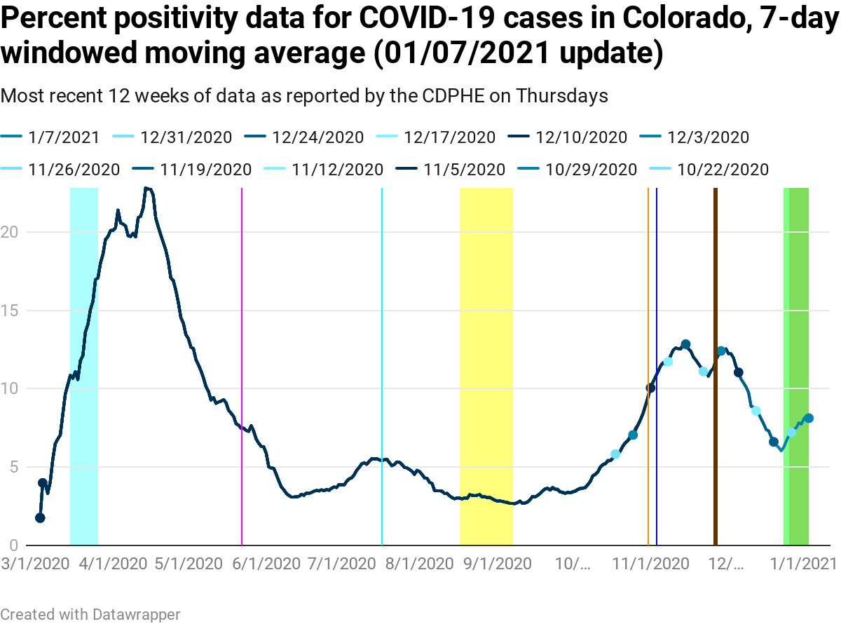
Percentage of COVID tests that are positive (aka percent positivity)
The positivity percentage peaked twice, once before Thanksgiving and once after (and because of) Thanksgiving. Both spikes were about 14% in the raw data, or 13%/12.5% respectively in the 7-day windowed moving average data shown below. And as we can see from the figure, the drop in positivity percentage stopped right before Christmas. This is still likely related to the Christmas holiday since most schools were out most if not all of the week prior to Christmas.
The question now is how much positivity percentage will go up and when it will start dropping again. If I may be so bold as to make a guess, I’d guess that it’ll turn around any day now if it hasn’t already and drop some now that the holidays are over and students have not yet returned to class. But it’ll start slowly climbing again as soon as schools restart in-person and hybrid education. But this time it’ll start from a much higher baseline (> 5%).
With respect to the data instability period, my new methodology shows 0-9 days of data instability, while the old methodology was 0-4 days. The difference is due to a significant update in many positivity percentages in the data from September 10. Since September 10, the data has been completely stable with 0 days of instability.
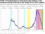
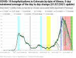
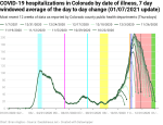
New hospitalizations by date of illness onset
During the first wave, new hospitalizations per day by date if illness onset never rose above 150 in the raw data or above 108 in the 7-day moving windowed average. The second wave peaked at 242 raw and 211 in the 7-day average.
In my last update I wrote “I’m going to hypothesize that [the exponential doubling period would] be nearly exactly the same [as the new cases period] once the data settles down.” Looking at the data, the exponential doubling period for new hospitalizations was about 19 days starting in mid-September (a weaker argument could be made all the way back to the end of August). The exponential growth in new cases was slightly faster, with one doubling as short as 14 days and the longest being 19 days, again starting in mid-September.
The difference between the doubling rates is intriguing, and it’s very tempting to speculate why they were different. The problem is that I lack the epidemiological or public health expertise to do more than speculate, so I will leave this one to the experts.
I will admit, however, that I called for a lockdown on November 19 that was not implemented and was not needed. In the future I’ll be more careful about calling for a lockdown specifically, although I reserve the right to call for more stringent measures.
My new methodology for calculating the data instability period calculates between 16 and 51 days of data instability over the entire dataset, as compared to 35-56 days using my prior methodology. However, there’s a significant difference between the first wave (and the bump over the summer) vs. the second wave. The first wave had a data instability period between 25 and 51 days, while the second wave was 16-22 days. And the old methodology resulted in the instability period bouncing around a lot as updates were made. Whether my new methodology is more stable or not remains to be seen.
Finally, let’s remember the timeline above. It takes 8-14 (mean 11) days from someone to show symptoms of COVID until they’re hospitalized (assuming they’re sick enough to need hospitalization, of course). And if the data is unstable for at least another 16 days, then it takes at least three and a half weeks from illness onset until the hospitalization data starts being reliable. And as we can see from the data below, the outer edge of the stabilization period is only

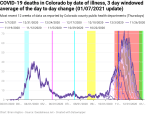
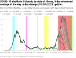
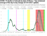
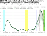
New deaths per day by date of illness onset
At the moment the peak in new deaths by date if illness onset is November 16 in the raw data and November 18 in the 7-day windowed average data. This is a few days later than the peaks in new cases per day and new hospitalizations per day, but it’s within the 7-day average period, so I’m not at all concerned about the disconnect. I would never expect the peaks to line up exactly due to the fact that a lot of COVID spread happens in discrete outbreak events that might or might not line up exactly with peaks.
Unfortunately, the peak of the second wave was quite a bit higher than the first wave, which means a lot more people died in the second wave than had to. I called for significant lockdowns that never came, and because they never came, a lot of people died unnecessarily. I understand the Governor’s desire to re-normalize life as much as possible, and the limits to federal aid that he had to work within, but I will continue to believe that more should have been done. I’ll have more to say about that in the future, and it’s quite possible that I will oppose the Governor’s re-election in two years over this issue.
One thing to notice is that we’re seeing the formation of a shoulder in the data – it peaks around November 18, drops a little, then levels out before falling again. Given the spike in new cases we had as a result of Thanksgiving, a shoulder or even a second peak is to be expected. However, we can see that the data’s not yet stable enough for the week after Thanksgiving to say how bad it really is.
Looking at the figures below, we see that I’ve calculated the data instability period to be quite large – 11 to 69 days. This compares reasonably well to my old methodology that had 37-73 days. As with the instability of the hospitalization data, there’s a difference between the instability of the first wave and summer (30-69 days) and the second wave (11-29 days).

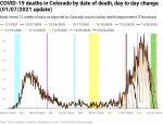
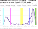
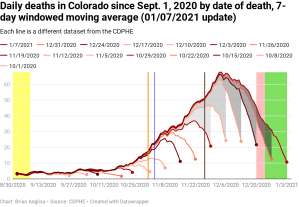
New deaths per day by date of death
When we look at the exponential growth of new deaths by date of death, we see that there were about three periods of growth with an average doubling period of 16 days. Exponential growth started at around October 19 and peaked out (at least so far) around December 4. Given the timeline above, we would expect that exponential growth in new deaths would be reasonably close to 38 days. And when we look into the data 38 days back, we see that we’re very close to when exponential growth in new cases by date of illness onset started. This is hardly a surprise given the timeline comes from national and international data, but it’s a good check that my own analyses aren’t completely off base.
There looks like there might be the start of a shoulder forming around Christmas as well. If we remember the timeline from above, people die from COVID at least 8 days after contracting the disease, but at an average of 38 days after exposure. This suggests that, if a shoulder is actually forming, it’s likely partly due to the spike in new cases after Thanksgiving.
Using my new methodology for calculating the instability period of the data I found that this data is unstable for 8-15 days. My previous methodology found 9-12 days, so they’re roughly comparable.

Comparison of new deaths by date of illness to new deaths by date of death
Looking at the figures below it appears that the peak in the new deaths by date of death has pretty much stabilized at this point, which is what we’d expect given the instability period is only about two weeks. But the data for the new deaths by date if illness onset is still showing some instability around the peak, which is again expected.
Once the peaks of both datasets have stabilized we’ll be able to compare them to each other and get another indication of the delay from illness onset to death (38 days average per the timeline above).

Observations of COVID cases in the Jefferson County School District
As I mentioned back in November, I’ve also been following the the COVID-19 dashboard for Jefferson County School District because my kids attend school in the district and my wife teaches in it. As we would expect, reports of new infections were low between Thanksgiving and the start of second semester because the entire district switched to remote-only education after Thanksgiving.
The school district had exponential growth from essentially the start of in-person/hybrid learning through about November 9, matching the growth in both Jefferson County and in the state pretty closely. Cases then dropped, rose again, and then dropped over the winter holidays, likely as a result of a drop in reporting. Nothing there is really a surprise.
The problem now for the district is that the number of cases being reported since school restarted last week is on par with where the district was in early November while cases were still going up. There’s not enough data yet from the spring semester to say if cases are going up or down in the district, but being at the same point you were at a week before the last peak isn’t a good starting point when you’re trying to get back to students back into the schools.
I’ve got a better idea about what to look for in the data this time when I go looking for exponential growth again. I missed it in the fall, but now I know what I’m looking for, I should be able to spot it at least one doubling period earlier. Whether anyone will listen to me when I say the district has entered exponential growth is an entirely different question.
—
The second wave is still going strong, even if it is currently weakening somewhat. All it takes is a new strain that’s even more contagious, people failing to do their civic duty to follow the control guidelines (masks, distancing, and avoiding large groups, especially indoors), and schools to go back in-person and I’m concerned that we’ll be looking at new peaks in the second wave yet again.
—
- The first cyan highlighted region: between March 15 and March 26, Governor Jared Polis institutes controls statewide to reduce COVID-19 transmission.
- Magenta line: May 22, the date that most schools have ended for the spring semester and summer break starts.
- Cyan line: July 17, the day that Gov. Polis re-institutes a statewide mandatory mask order in response to rising cases of COVID-19 and the test positivity percentage exceeding 5%.
- Yellow highlighted region: August 17 to September 7, the period over which schools start the new school year with in-person, remote, or hybrid. Most schools are back in-person starting September 8.
- Orange line: October 31, Halloween. There are ways to trick or treat safely during a pandemic, but that doesn’t mean everyone was as careful as they should have been.
- Blue line: November 3, Election Day. With tens of millions of Americans standing in long lines and using equipment that may not have been properly sanitized between each use, there’s a chance that there was additional COVID spread.
- Brown line: Thanksgiving. The holiday is often a full week long, especially for families with school-aged children, but the eating holiday can result in multiple families gathering without effective masking. There will be a spike after this – the question is how large.
- Green highlighted region: Christmas break. Starts on Christmas Eve and continues through January 3, 2020. There will be a spike due to the holidays, but again the question is how large.
- Red highlighted region: This is the period of time that we can expect the data to change significantly (by more than 20%), nearly always increasing, due to updates from doctors, hospitals, labs, and morgues. I call it the “instability period” because the updates mean that we can’t trust the data to be accurate until this period of time has passed. It’s about 12 days for new cases, 9 days for test positivity percentage, 51 days for new hospitalizations, 69 days for new deaths by date of illness onset, and 15 days for new deaths by date of death.
