Everything is up and looking to continue to go up until Coloradans take the pandemic seriously again. Which may be only after Governor Polis is forced to impose a second statewide lockdown.
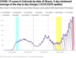
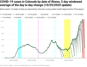
Another week of data, another week of record numbers of cases. We can’t look strictly at the numbers because of how little we were testing back in March and April when COVID-19 was raging in the state, but we can look at the rate that cases are going up. And the rate that new cases are going up is very similar today to what it was in March, right before Polis instituted the statewide stay-at-home order.
There is no indication this is going to stop. We just had Halloween, Thanksgiving is coming, and then there’s Christmas and New Years – all big food/drink holidays. And it’s tough to have a sit-down family meal while distanced and wearing a mask.
This is going to get worse before it get better.
For a description of what the highlighted regions are, please see the end of this analysis. And next week I’ll add Halloween and Election Day to the regions being tracked. I expect that we will see more cases, hospitalizations, and deaths from both.
That said, please vote. Getting Trump out of office is worth the risk.

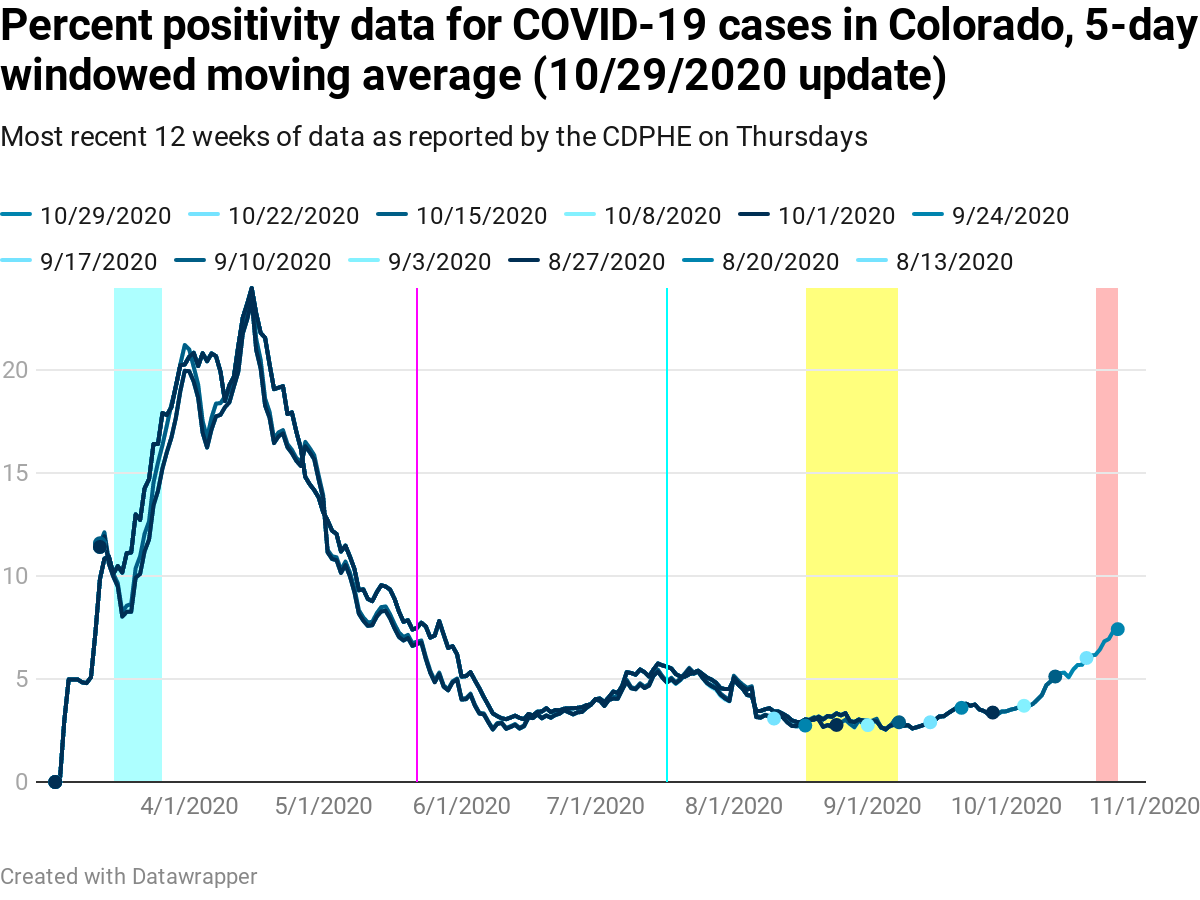
The 5-day windowed moving average of test positivity percentage is up to 7.42% statewide. That’s the highest positivity percentage since May 24, and it’s almost certainly going to keep going up.
And like two weeks ago, the graph clearly shows the correlation of the rise in test positivity started after Labor Day and has accelerated significantly in the last few weeks
We can also see from the positivity graph that the positivity was low through roughly Labor Day and then started slowly climbing, with a rapid climb in the last week or two. When schools went back into session, people stopped taking the virus seriously and started hanging out without wearing masks or distancing again, and until masks and distancing are taken seriously again, there’s no reason to believe this will drop.
As an aside, there are a lot of people in the media and on social media falsely claiming that the genetic test for COVID is inaccurate. In fact it’s very accurate, with only a 3% false positive rate and no cross-reactivity with anything but the original SARS virus from 2003 and 2004.
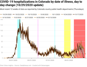
New hospitalizations by date of illness onset are now the highest they’ve been since April. The 5-day windowed moving average has it at April 29, but the raw data has the last value this high at April 22, deep in the depths of the first wave. We’re well outside the realm of normal variability in the data and have shifted firmly into second (or third) wave territory. This is the reason Gov. Polis and the Colorado Department of Public Health and Environment (CDPHE) are worried about the hospitals filling up again
While I haven’t updated the instability period (red highlighted region) in the graphs, my calculations show the instability period rose from about 40 days to more than 60 days. I’m trying to understand why it bounces around so much before I raise it again, so I left the instability period alone for this update.


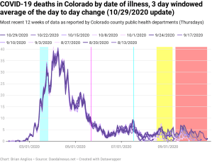
We expect the graph of new deaths by date of illness onset to lag pretty much every other dataset during the pandemic, and it is lagging. But this week we see that the rise in new deaths by date of illness onset has driven up a spike in mid-September, which would be about when we’d expect to see the start of a rise in deaths due to cases that were contracted Labor Day weekend. We’ve got several more weeks before we’re out of the instability period for this data, but this dataset is starting to look like we would expect it to. Unfortunately.
The totals still aren’t high, and that makes it hard to track using the metrics I’ve defined. But given cases and hospitalizations are rising with no end in sight as of yet, I’m afraid that we’ll soon get to the point where my metrics are good at tracking this dataset. Which will be bad for everyone.
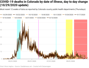
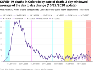
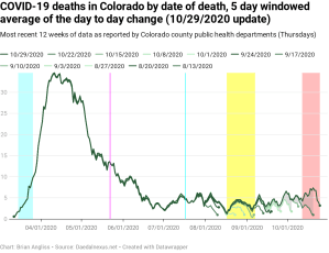
Two weeks ago I said “given new deaths by date of death have a high correlation with new hospitalizations by date of illness onset, we should expect deaths to continue to increase.” And that’s what’s happening – new deaths by date of death are up and have exceeded the small bump back in July. We’re now seeing people dying at a rate not seen since early June. And keep in mind that the delay from hospitalization to death averages 3-4 weeks, so the deaths that happened in early June were from people who were hospitalized in early May.

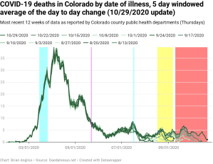
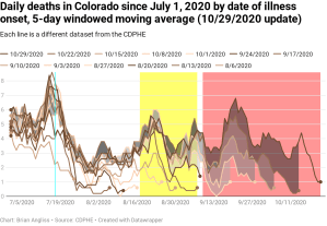
Finally, let’s compare the data for deaths by date of illness and the deaths by date of death since July 1, 2020, starting with the new deaths by date of illness onset (5-day windowed moving average).
Look at the gray region where it overlaps the red instability period. Notice how the lowest dataset (from 5 weeks ago) was down at about 1 death, but that every single week since that’s been updated upward to the point where we’re nearly at 7 deaths? That’s because so many deaths happening today are from infections that happened back around Labor Day.
Notice also back at the beginning of August there’s a bump of dark gray. That happened because several people who died in the last week were initially infected back at the beginning of August. That’s a delay of three months from infection to death.
Looking at the gray areas in the new deaths by date of death graph, we can see that there are massive updates from one week to the next and smaller updates even further back in time. But the more important thing to notice is that there is a clear trend in new deaths going back to mid-August. It’s not growing fast – yet – but there’s no question that COVID-19 deaths are rising.

The last two weeks have seen massive increases to new cases, percentage of positive tests, and new hospitalizations, as well as smaller but significant increases in new deaths. COVID-19 is running rampant through Colorado and we’re seeing the worst numbers since the trailing edge of the first wave. The difference is that we’re on the leading edge of the second wave (or third, if you count what happened in July as the second) and so we should expect that the numbers will continue to get worse until something significant happens.
And as we’re heading into the holidays (and we have to get through the massive superspreader event known as Election Day). Barring another lockdown I see us right back to where we were in March, with exponential growth, rationing care, PPE shortages, and massive numbers of new, preventable deaths.
I hope I’m wrong, but if the resistance to masks et al that I see on Facebook and Nextdoor are representative, I’m not going to be.
—
- The first cyan highlighted region: between March 15 and March 26, Governor Jared Polis institutes controls statewide to reduce COVID-19 transmission.
- Magenta line: May 22, the date that most schools have ended for the spring semester and summer break starts.
- Cyan line: July 17, the day that Gov. Polis re-institutes a statewide mandatory mask order in response to rising cases of COVID-19 and the test positivity percentage exceeding 5%.
- Yellow highlighted region: August 17 to September 7, the period over which schools start the new school year with in-person, remote, or hybrid. Most schools are back in-person starting September 8.
- Red highlighted region: This is the period of time that we can expect the data to change significantly (by more than 20%), nearly always increasing, due to updates from doctors, hospitals, labs, and morgues. I call it the “instability period” because the updates mean that we can’t trust the data to be accurate until this period of time has passed. It’s about 11 days for new cases, 6 days for test positivity percentage, 39 days for new hospitalizations, 43 days for new deaths by date of illness onset, and 14 days for new deaths by date of death.

Leave a comment