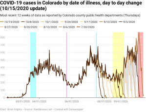
New cases are the highest they’ve ever been. Positivity is up over 5%. New hospitalizations are up. And new deaths are going up too.
As I said two weeks ago, new cases by date of illness onset increased at the same time that schools went back into session. We can see that from the graphs below (yellow highlighted region). The biggest jump even happened right after Labor Day, when nearly all of Colorado’s school districts went back to in-person (hybrid or full time) teaching. And as kids went back to school, parents went back to work, and pandemic fatigue kicked in, and cases started rising.
Now we’re setting new records for the number of new cases by date of illness onset. COVID-hoaxers and anti-maskers would like you to believe that this is because testing is up, and that’s a part of it. But only a small part of it.
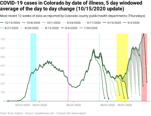
As a reminder – the highlighted regions and lines in all of the graphs are as follows:
- The first cyan highlighted region: between March 15 and March 26, Governor Jared Polis institutes controls statewide to reduce COVID-19 transmission.
- Magenta line: May 22, the date that most schools have ended for the spring semester and summer break starts.
- Cyan line: July 17, the day that Gov. Polis re-institutes a statewide mandatory mask order in response to rising cases of COVID-19 and the test positivity percentage exceeding 5%.
- Yellow highlighted region: August 17 to September 7, the period over which schools start the new school year with in-person, remote, or hybrid. Most schools are back in-person starting September 8.
- Red highlighted region: This is the period of time that we can expect the data to change significantly (by more than 20%), nearly always increasing, due to updates from doctors, hospitals, labs, and morgues. I call it the “instability period” because the updates mean that we can’t trust the data to be accurate until this period of time has passed. It’s about 11 days for new cases, 6 days for test positivity percentage, 39 days for new hospitalizations, 43 days for new deaths by date of illness onset, and 14 days for new deaths by date of death.
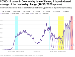
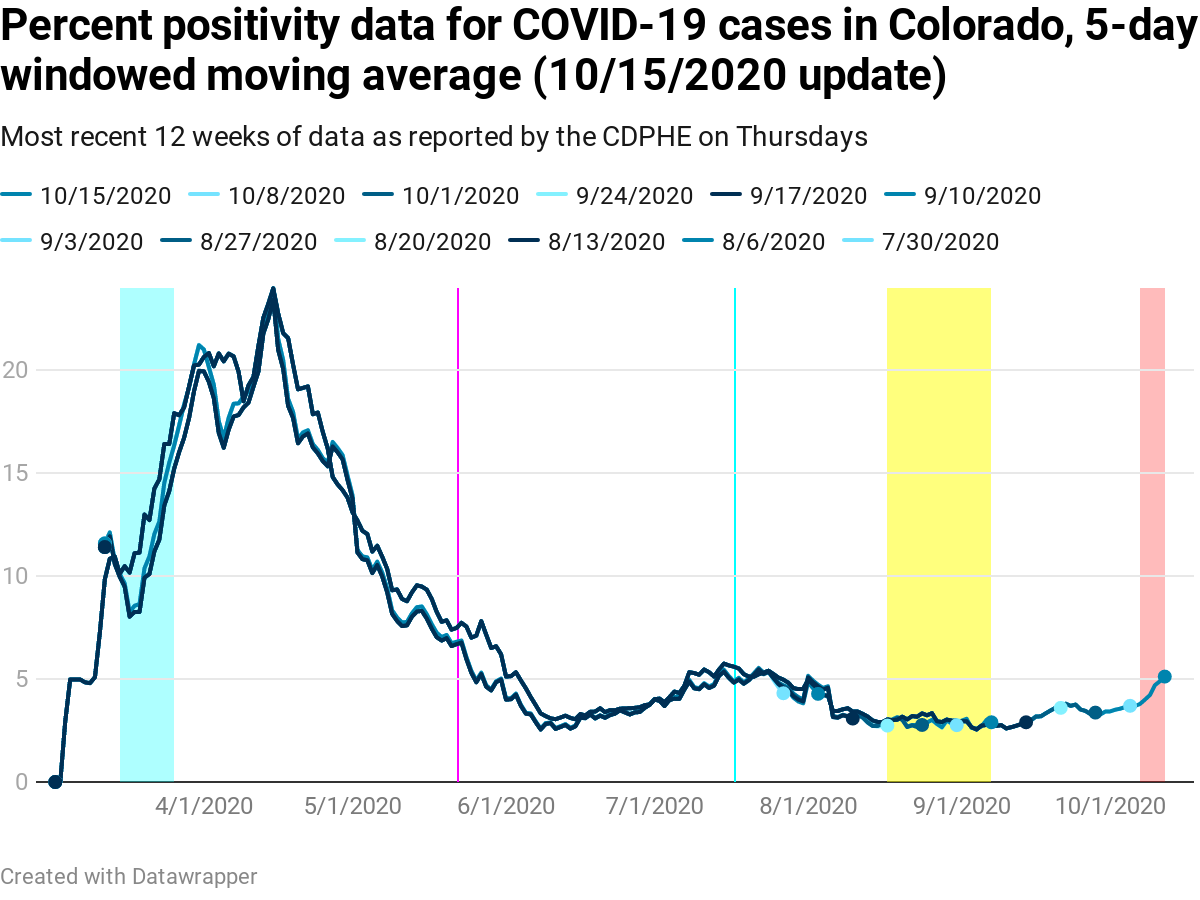
How do we know that the new cases are real? Because we know that the percentage of positive tests is going up too. In fact, in the 5-day windowed moving average image below, it’s up to 5.12%. The raw data had one day last week (the 12th) at 6.37%. That’s not good, but single day spikes like that are why I use the filtered data instead.
We can also see from the positivity graph that the positivity was low through roughly Labor Day and then started slowly climbing, with a rapid climb in the last week or two.
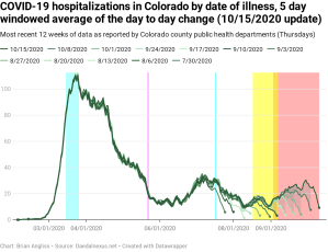
How about new hospitalizations by date of illness onset? We can see that the graph from two weeks ago, and even from a week ago, wasn’t really outside the normal variability of the data. As such we could reasonably guess that the rate of new hospitalizations was up, but we couldn’t really be sure. But this week there’s no longer any question – new hospitalizations are on the rise, and we can see that the trend we tentatively identified a couple of weeks ago was real.
Unfortunately, I was right when I said that “with new cases going up, it’s only a matter of time until new hospitalizations increase as well.”
Some good news, though, is that the instability period (red highlighted region) has dropped from 59 days to 39 days. I’m not entirely sure why, but it’s still good news as it means we don’t need to wait as long before we can be confident that the hospitalization data is high quality.

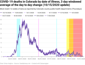
New deaths by date of illness are still relatively flat, which is good. But there are indications that we’re about to see them start to go up. When they do go up, though we’ll see it in data that is weeks, maybe even months old. The reason is that the mean time from admission to a hospital to when someone dies of COVID-19 is about three weeks. And given medical care is improving (a good thing), it’s not unheard of for people to die after months of being in the hospital. We’ll look at this in more depth below.
There are still some updates happening all the way back in July, but they’re relatively small. There are larger changes happening in late August, and there are larger updates the closer to the present we get. Unfortunately, the red instability period still overlaps the yellow school transition period, so we’re not yet getting good data on new deaths by date of illness and won’t for several more weeks.
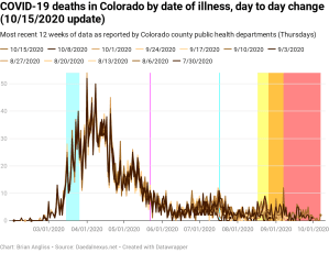
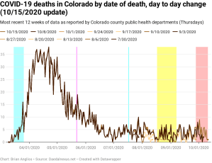
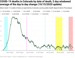
Two weeks ago I said “with an approximately three week delay, I would expect to see the start of a bump soon. But so long as new hospitalizations stay down, deaths generally will as well.” And at this point there is, unfortunately, no question that we’re seeing new deaths by date of death increase as well. And given new deaths by date of death have a high correlation with new hospitalizations by date of illness onset, we should expect deaths to continue to increase.
I’ve been saying for a while now that an increase in deaths was only a matter of time while hoping that medical treatments had improved enough to make this statement false. Tragically, it was not.
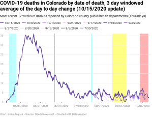
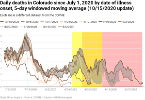
Finally, let’s compare the data for deaths by date of illness and the deaths by date of death since July 1, 2020. As with my last update two weeks ago, let’s focus on the gray areas (the week-to-week changes from one dataset to the next for the last four weeks).
We can see that the gray periods in the deaths by date of death (lower left) go far back all the way back to early July (and thus likely beyond), but that the farther back in time you look, the narrower the gray band is. The narrower the band is, the more stable the data is.
But also notice how much some of the data changes and keep in mind that this is the 5-day windowed average. This means that for every increase in one new death between datasets there is a corresponding increase of five deaths in the raw data. And there are a few dates on which the increase is as large as six new deaths (for a corresponding increase in the raw data of 30 new deaths). And in the red highlighted region it’s common to see shifts from one dataset to another of 2-3 new deaths, for a corresponding additional 10-15 COVID-19 deaths added from one dataset to another.
And we can’t neglect to notice that the gray band goes all the way back to early July. That means there are patients dying today who were hospitalized with COVID-19 over three months ago. Not a lot, but some.
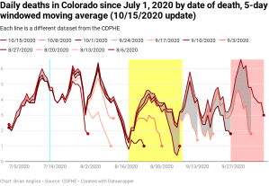
Now let’s look at the gray areas in the new deaths by date of death (lower right).We can see that there is a slow increase in the number of new deaths after reaching a low in mid-August. And we see that the gray areas narrow much faster in this data than they do in the new deaths by date of illness onset data. Given we know the date of someone’s death from COVID-19 much faster than we know the date that the deceased initially showed symptoms, this makes logical sense.
That said, there are still small changes happening in the data back in July and August. These small updates are likely the result of corrections as epidemiologists review causes of death to ensure that COVID-19 is the actual cause of death and not something else.
In the last two weeks new cases by date of illness onset have increased significantly and are now higher than they were in July. New cases are even higher than they were in the early days of the pandemic, but that’s almost certainly due to the increase in number of tests since then.
The percentage of positive test results (the number of positive tests divided by the total number of tests) is now up over 5% and, with some hindsight, we can see that it’s been increasing since roughly Labor Day – when most schools in Colorado went back to in-person classes. Given this has exceeded the Colorado Department of Public Health and Environment’s 5% threshold that they use to impose new restrictions, we should expect that a new round of COVID-related restrictions will be coming soon.
New hospitalizations by date of illness onset are now clearly showing an increase as well, which will inevitably lead to an increase in new deaths. And new deaths by date of death are showing an small increase that will, tragically, go up from here until we collectively take the virus more seriously than we have been in the last few months.
As I said in my last update, given the number of new cases showing up in my own school district and in the counties where I live and work, COVID-19 is going to get worse from here. And in the last two weeks the course of the pandemic has definitely got worse.

Leave a comment