Cases are way up. Positivity is up a little. Hospitalizations are up just a bit. Deaths are still low, but unfortunately that’s not going to last.
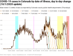
As with the data from two weeks, ago, there is no question that there has been an increase in new cases of COVID-19 by date of illness onset since schools went back into session. At this point we’re nearly back to where we were back in June when Governor Polis put a mandatory mask order into place for the whole state.
I pointed out in my last update that there was a correlation between the increase in new cases and the return of teachers and students to school. The data below shows it even more clearly simply because the number of new cases has continued to climb. But we shouldn’t assume that the increase is strictly due to transmission at school. With schools back in session with in-person classes (often in a hybrid model), more parents are able to return to their jobs or work remotely less than they had been in the spring and over the summer. And that means there are more opportunities for the virus to spread.
And spreading it is.
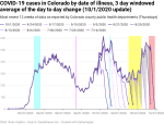
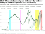
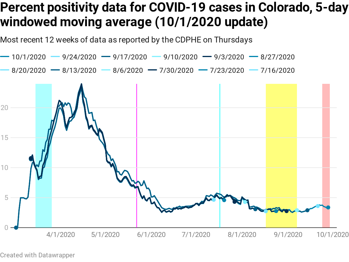
Two weeks ago there was a small increase in the percentage of tests coming back positive (aka positivity percentage), but it was so small it was within the noise. That’s no longer the case as the image below shows – positivity percentage is definitely up from the low in late August/early September. I’m tempted to say that part of that low was that kids were back in school so Coloradans weren’t traveling, but most schools were strictly remote-only and so there was a massive amount of enforced distancing. And that may be the case. The correlation between the rise in positivity percentage and the return to in-person school is certainly suggestive. But as always, correlation isn’t causation.
As I mentioned in the last update, there had been a significant update that affected positivity percentage in the early days of the pandemic. As a result, the stability period for this data increased from about a day to 18 days. I said then I expected the stability period to drop with new data, and it has. The early days are still pretty unstable (17 days), but since July 1 the data is now down to 6 days of instability. I expect it’ll drop even more. And then we’ll have another infrequent but significant update that throws it all into a tizzy again.
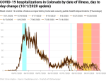
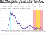
New hospitalizations per day by date of illness onset are definitely up some since the start of in-person school, but they’re not back up to the levels seen in July. This is a good thing, but with new cases going up, it’s only a matter of time until new hospitalizations increase as well.
I reran my stability check on the data for the first time in a month and it’s much worse this time – new hospitalizations are taking nearly two months (59 days) to settle reliably within 80% of the final value. The reason is that there are many days that are being updated months later. I’m guessing that this is as hospitals and public health officials are reviewing old test results and diagnoses and realizing that someone who entered the hospital was suffering from COVID-19. So the updates are good over the long run. But it’s happening frequently enough that I can’t justify calling the updates “outliers” and ignoring them in the statistics.
Ahh, the joys of tracking science as it’s being conducted in real time.

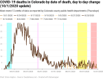
New deaths by date of illness are still flat, which is fantastic. It’s also entirely expected given that there is approximately 3 weeks from admission to the hospital and dying of COVID-19. Since new hospitalizations by date of illness are up just a little, I would expect that new deaths by date of illness to be mostly steady for a while yet.
Two weeks ago, new deaths by date of illness had an instability period of 51 days. This week it’s even longer – 77 days. There are two reasons for this. First, the deaths by date of illness data has the same problem that the new hospitalization data does – large value updates that happen months later. Second, my stability criteria requires at least eight deaths per day (with 10 preferred) for me to be willing to use the data. Thankfully, new deaths have been below eight per day for quite a while, and so my instability criteria is biased toward earlier in the pandemic when the data was less stable.
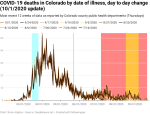


New deaths by date of death, which shows a very high correlation with new hospitalizations by date of illness, but delayed by about three weeks, are thankfully remaining low.
Two weeks ago I said we would expect to see a small increase in the new deaths by date of death “in the next couple of weeks.” It’s been two weeks and there isn’t a noticeable increase yet. This is good, and I’m quite happy to have been wrong on my timeline. Hopefully I will continue to be wrong on my timeline, but with an approximately three week delay, I would expect to see the start of a bump soon. But so long as new hospitalizations stay down, deaths generally will as well.
Unfortunately, given what we know about how COVID-19 is transmitted and how it affects people, it’s only a matter of time. But hey, if I’m wrong, that’s good.


Finally, let’s compare the data for deaths by date of illness and the deaths by date of death since July 1, 2020. Specifically, let’s focus again on the gray regions on both graphs, as they show how the instability period actually works.
We can see that the gray periods in the deaths by date of death (left) go far back all the way back to early July, but that the farther back in time you look, the narrower the gray band is. The narrower the band is (the difference between datasets over the last four weeks), the more stable the data is.
And where the gray band is wide shows us that most of the recent deaths are associated with COVID-19 infections that first showed symptoms back in August.
Looking at the gray period in the new deaths by date of death (right) shows that the data stabilizes very quickly. In this case, we see a big step between one dataset and the next one a week later, followed by a much smaller step for datasets two weeks apart. And after that, the data in each subsequent dataset is nearly identical.
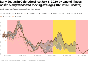
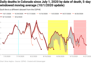
New cases are up and show correlation with the return of students to school, especially in-person learning that started in early September. Percent positivity is up, but not yet to the 5% threshold that Polis and the Colorado Department of Public Health and Environment use to put in place more restrictions. New hospitalizations are showing more signs of an increase than two weeks ago but it’s not so large yet to say for certain. New deaths by date of illness onset are showing that current deaths are from infections back in early and mid-August, before in-person learning happened across the state. And new deaths by date of death are stable for now.
What next? Given the number of new cases showing up in my own school district and in the counties where I live and work, it’s going to get worse from here. The question is whether the counties and state reimpose restrictions quickly enough to limit it to merely “bad” instead of “really bad” or “horribly awful.

Leave a comment