COVID-19 cases are up and now hospitalizations are too. At the rate we’re going, it’s only a matter of weeks until Colorado will have to go into lockdown again.
Last week, Governor Jared Polis issued a statewide mandatory mask order for everyone in an indoor public space. In response, a number of county sheriffs (El Paso, Washington, and Weld) announced that they would not be enforcing the order and large numbers of individuals said publicly on Polis’ Facebook page and Twitter feed that they would not be wearing masks.
This “I got mine – screw you” ideology explains, in large part, why COVID-19 in Colorado is again spreading rapidly. Cases are increasing and are already nearly equal to peak in the 5-day windowed average from April. And now we’re seeing hospitalizations climbing too.
While I remain hopeful that whichever strain of COVID-19 is circulating right now is less lethal than the first strain to hit Colorado, but I’m afraid that it’s only a matter of time before deaths start to climb as well.
COVID-19 cases in Colorado, by day of illness onset
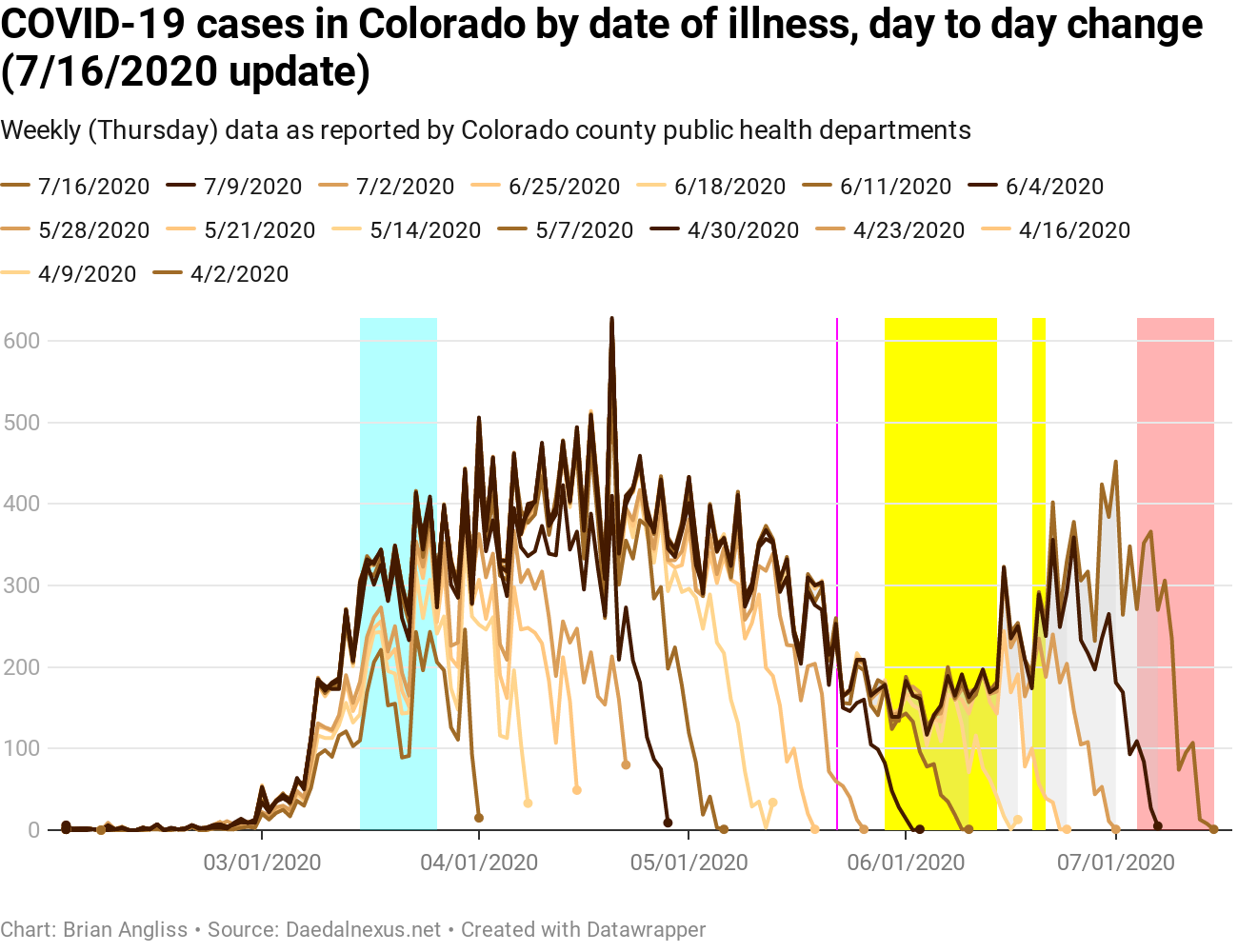
I’ve updated the highlights on the graphs again. Now there are three areas – the cyan area which occurs when Polis was instituting statewide policies to combat the spread of COVID (March 15-26), the yellow area which is when the main BLM protests were happening in Colorado (although smaller protests continue to this day), and the red area that defines the data that is not trustworthy due to reporting lags (back 11 days from the date of the dataset). I’ve also left in the magenta line on May 22, which is the day that most Colorado schools let out for the summer.
As usual, the raw data is really noisy and shows weekly spikes and dips that occur because of how different counties and organizations report. But even so, we’re looking at the most recent spike in cases at 452 new cases on July 1. It’s not up to the peak of 624 on April 20, but it’s risen a low of 128 in less than a month. If we continue to increase at the current rate, we’ll exceed the April peak in the next 2-3 weeks.
This is not good.
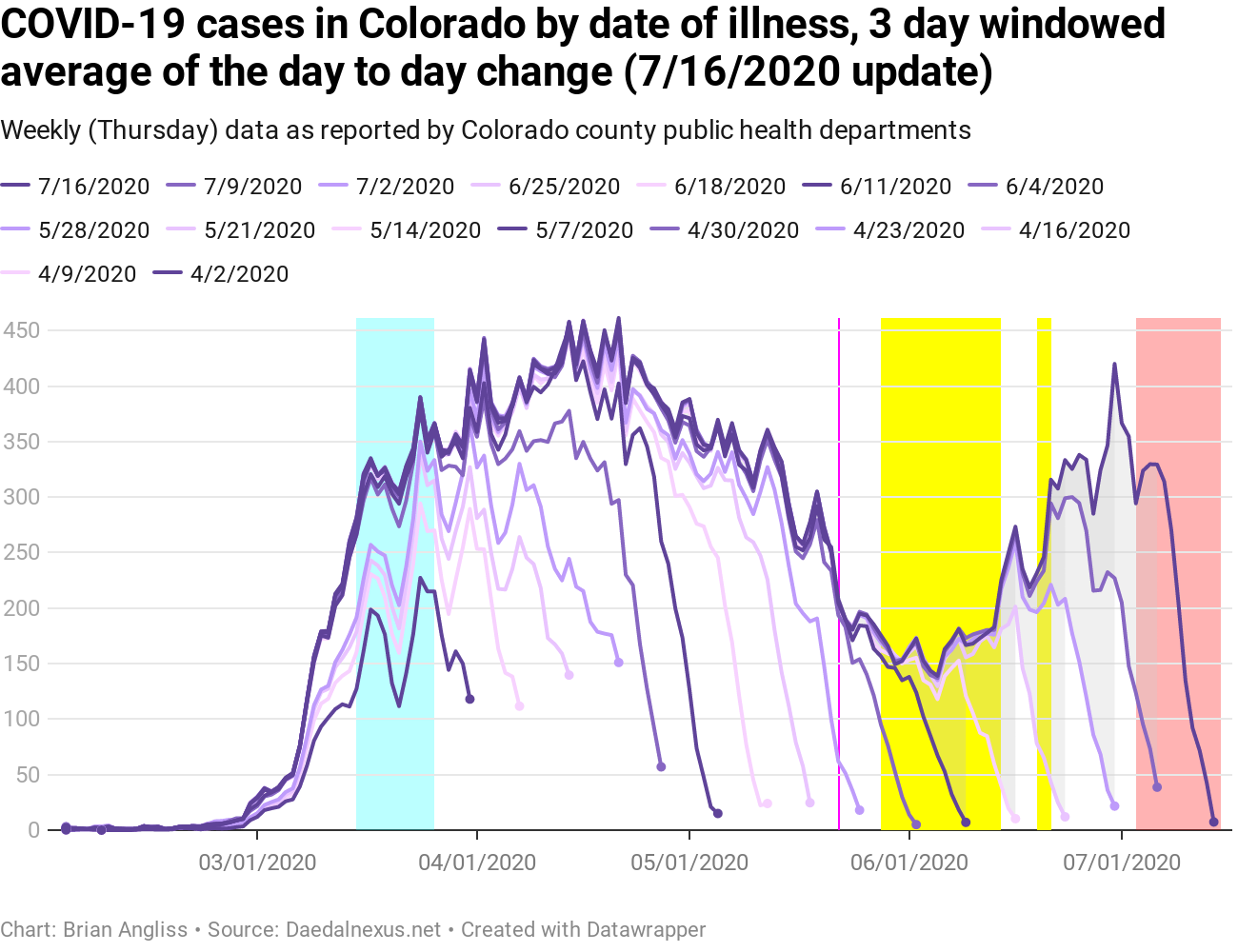
The 3-day windowed average is a lot less noisy as always, but it shows that the recent rise in cases is even closer to exceeding the April peak. The peak on April 21 was 461.33 cases. The recent max on June 30 was 420. We could see a new peak in the 3-day windowed average within 1-2 weeks. And if growth starts looking exponential (it’s not yet, but that could be because of noise in the data), that could come even faster.
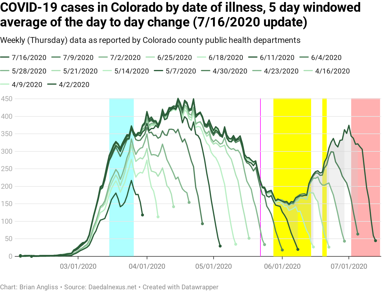
The 5-day windowed average has less weekly noise, but shows much the same problem as the 3-day windowed average does – growth in the number of new cases is likely to exceed the April peak in the next 1-2 weeks if the current growth rate continues or worse – accelerates.
Again, this is not good. And this is why Denver Public Schools has delayed the start of in-person classes for the 2020-2021 school year by two weeks. If the rate of COVID growth isn’t brought way down again and soon, only delaying two weeks is looking very optimistic.
COVID-19 hospitalizations in Colorado, by day of illness onset

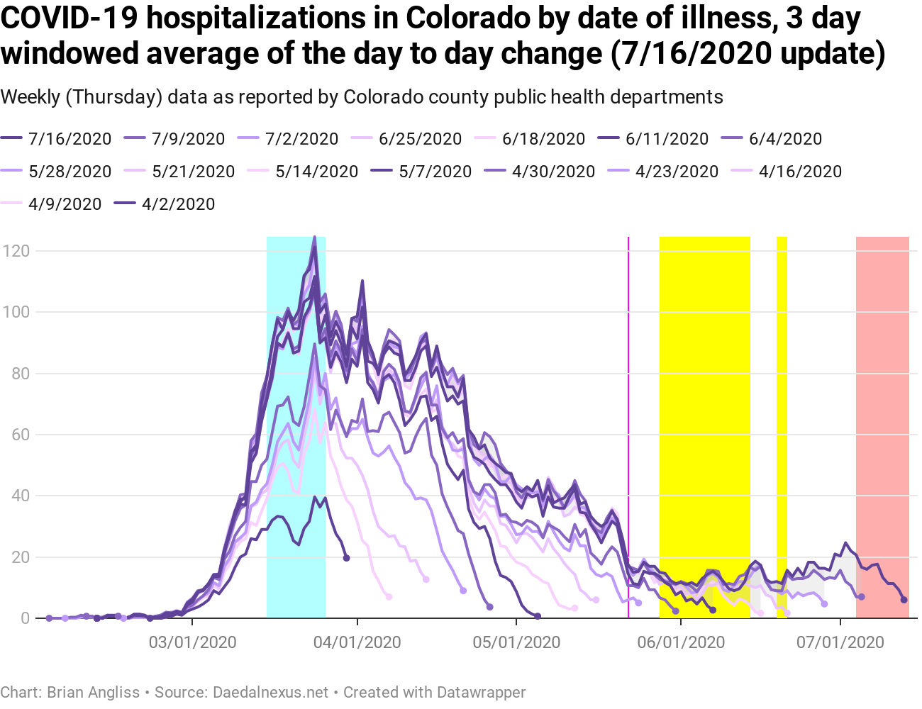
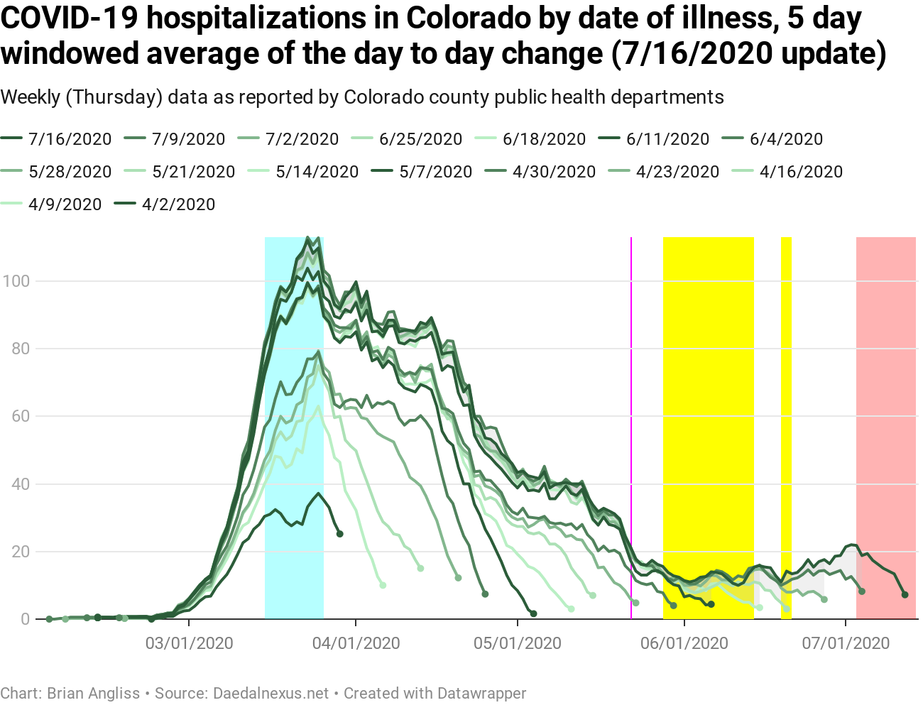
As we all know by now (because public health officials keep reminding us), it is theoretically possible that the increase in cases could be a result of a large increase in the amount of COVID testing. It’s partly for this reason that new hospitalizations are usually considered a better metric for rising cases of COVID. So what are new hospitalizations doing at this point?
We can see from the raw data that new hospitalizations are still low, but there’s worrying signs of an increase. But it’ll be easier to see in the graphs of the windowed average.
Before we go into that, however, notice that the red highlighted time period is smaller for hospitalizations than it is for cases. In this case, reporting lag is only 8-9 days. However, because the total number of hospitalizations are much lower than the total number of cases and because hospitalizations can rise or fall months later, the data is much less stable over the long term. So while we get to 80% of the final value within 8-9 days (at the moment, anyway), we can’t be confident that we’re within 95% of the final value even now for the peak back in March.
So what do the 3-day and 5-day windowed averages show us? In short, that hospitalizations are rising in response to the rising number of cases. Both show it clearly in the most recent dataset, and the trend of both increases goes back to mid-June if not all the way back to early June. This could be related in part to the BLM/George Floyd protests, but it’s at least as likely that the increases are related to having schools out for summer vacation, tourists and families unwisely resuming summer plans for travel and recreation, and the clearly incorrect belief that COVID-19 wouldn’t be as bad in the summer.
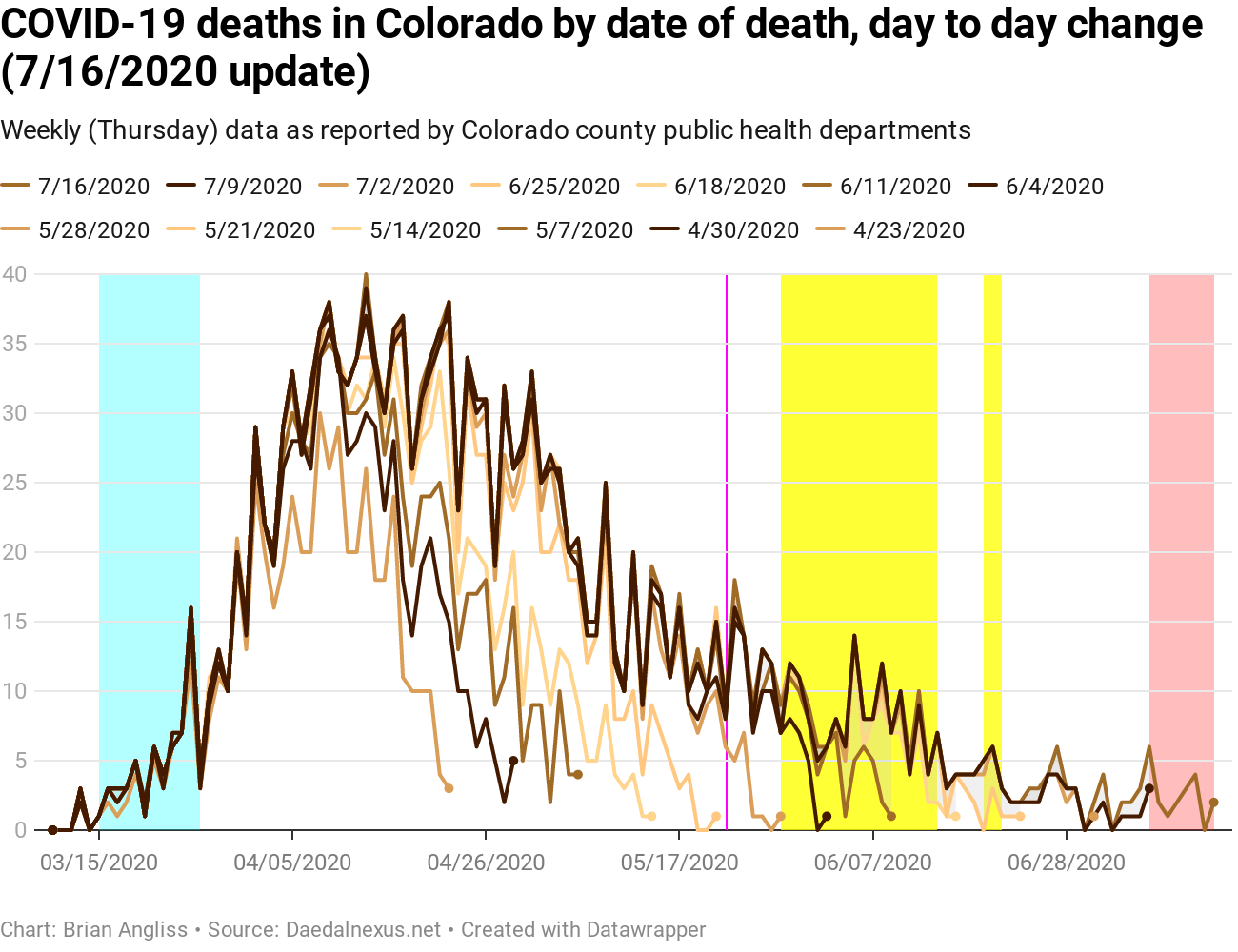
COVID-19 deaths in Colorado, by day of illness onset
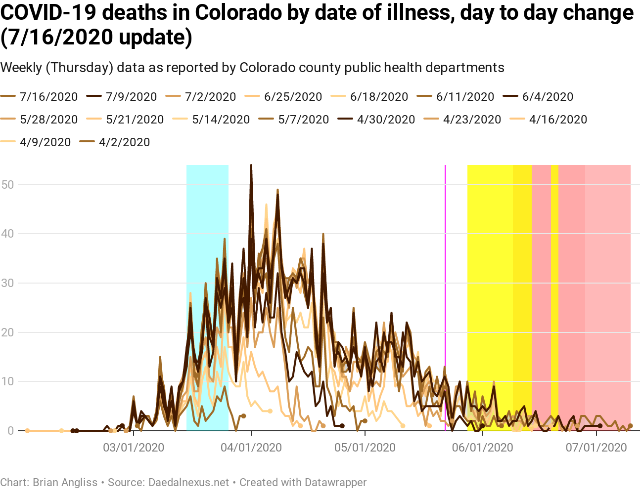
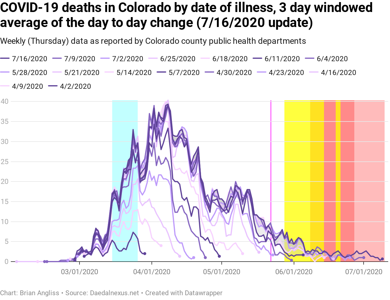
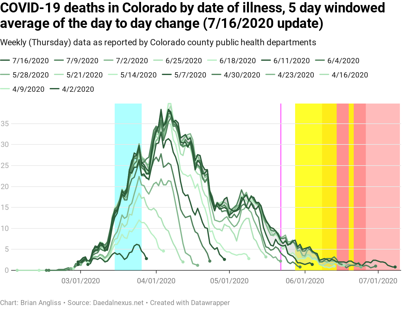
Before I describe what I’m seeing in the new deaths by date of illness data, let me explain the more complicated highlighting in these graphs.
The pink region is the period where we can’t trust the data to be useful because of the usual reporting lags. But the lag for deaths by date of illness is about 13 days, the longest of all the types of data that I’m following and analyzing. The red region represents the 19 day mean delay between the onset of COVID symptoms and death from the virus or associated complications. The yellow regions are the BLM/George Floyd protests, and the orange regions are where the 19 day delay and the protests overlap.
The important thing to realize about the deaths from date of illness onset is that the data is not reliable for the sum of the 19 day mean delay of death plus the 13 day reporting lag, for a total of 32 days of unreliable data. Which means we can’t claim that the number of deaths are staying low for 32 days prior to the date of the dataset. For this week’s dataset, that means we can’t draw conclusions about deaths by date of illness onset for any data more recent than about June 8. And the majority of the rise in cases and, more recently, hospitalizations has been much more recently than June 8.
At this point I’ll keep tracking the data for deaths by date of illness onset, but there won’t be much to say about it for at least two more weeks. About the only thing we can say is that, when people start dying from the recent surge of COVID cases, the deaths will appear as updates to the totals in June because that’s when symptoms would have shown up. That pattern to the data should be pretty obvious if, or rather when, it happens.
COVID-19 deaths in Colorado, by day of death
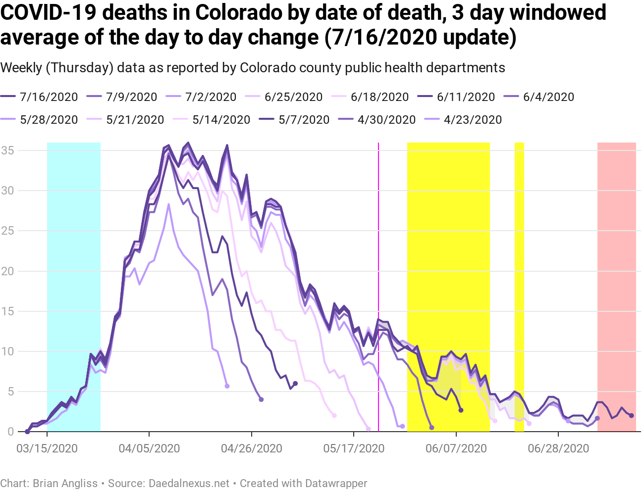

The same 32 day delay does not exist for data by date of death, however. In fact, the reporting lag for deaths by date of death appears to be the shortest of all the lags for the time being. This could change if the rate of deaths climbs significantly with the new cases and hospitalizations, but only time will tell.
Looking at the raw data of deaths by date of death, we can see there was a little blip in early June, but that would have been associated with infections that happened, on average, nearly three weeks prior. And we can see that the overall number of deaths is quite low, which is wonderful.
Looking at the 3-day and 5-day windowed average graphs we can see that there have been some revisions to deaths all the way back to mid-April, but that the revisions are small (less than two deaths per day up or down in the 3-day windowed average). And recent data looks like the number of new deaths is relatively stable at below four per day. This is good.
Unfortunately, the question isn’t whether deaths will start rising again, because they will even if the current strain of the virus is less lethal. The question is when will deaths start rising again, and how fast will they rise this time.
—
There’s one more graph we should look at, at below left. It shows the 5-day windowed averages for new cases, new hospitalizations, and new deaths by date of illness, but all normalized so we can better see how the three series line up in time.
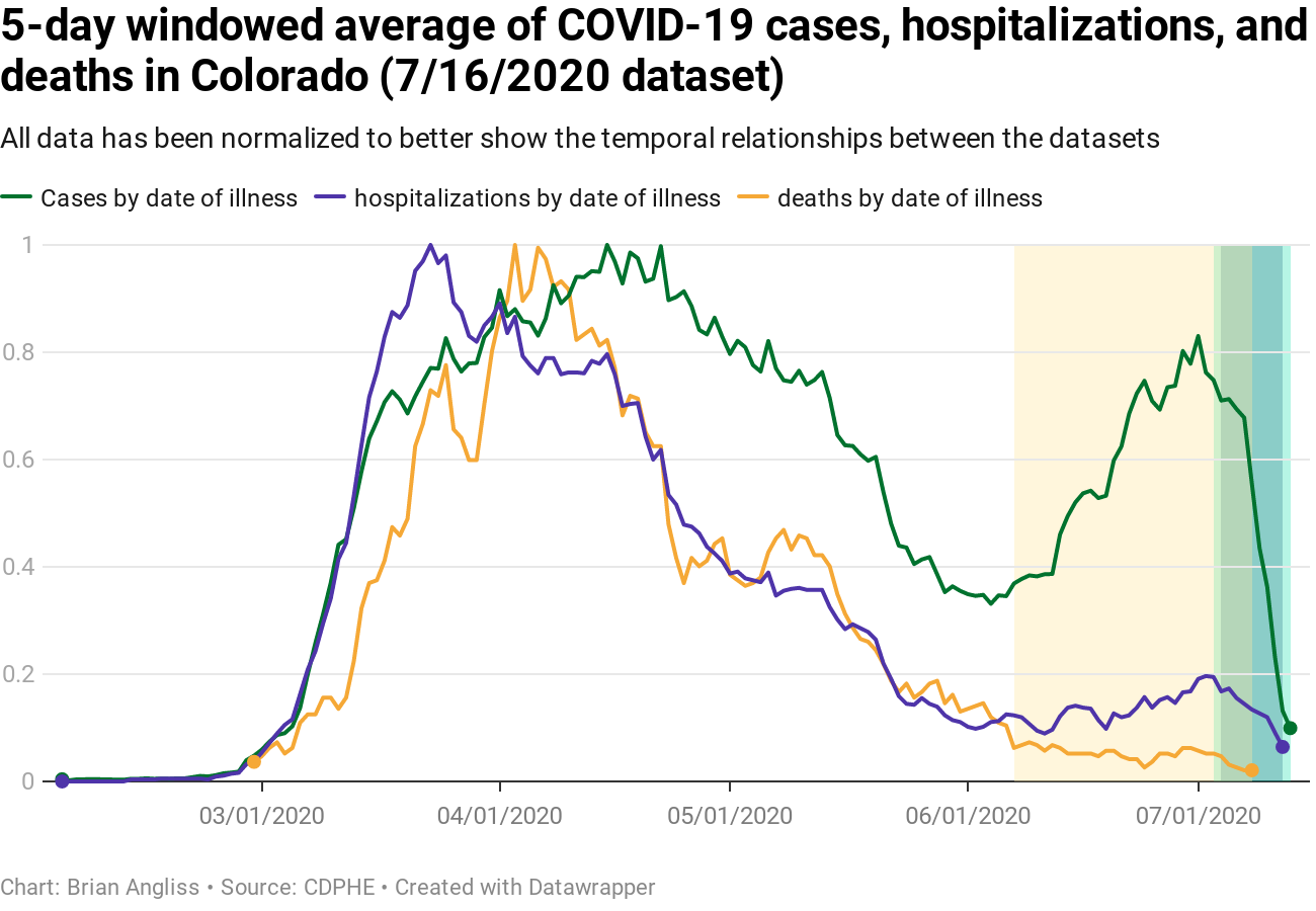
If this COVID surge is as deadly as the last one was, then we’ll start seeing deaths by date of death increase along with hospitalizations, but about 19 days later. And those same deaths will drive adjustments to the deaths data back in June in the deaths by date of illness onset.
I hope that the latest strain circulating around the United States is less lethal even as it seems to be more contagious. But as I said above – only time will tell. And even if it is less lethal, at the rate new cases are rising, it may only be a matter of time before new deaths increase too.
If I had to, I’d guess that we’re looking at the entire state of Colorado going back into lockdown again within three weeks. And the only way to avoid it is to convince tens of thousands of self-centered, rigid anti-mask ideologues to start caring about other people and accept that they were wrong about COVID.
I don’t know about you, but I’m not going to hold my breath.
Unless I happen across a stranger who’s not wearing a mask, anyway.

Leave a comment