Too few Coloradans are wearing masks and social distancing, and so cases are rising, hospitalizations are starting to rise, and tragically deaths will too.
I’m a little short on time, so I’m not going to dive too deep into the details of the 7/2 dataset compared to previous weeks except to point out that cases are still increasing and now we’re starting to see a bump in hospitalizations as well. If you want to look more closely at each of the main graphs I’ve generated, please click on the thumbnails in the gallery below.
What I want to focus on is three new charts I made and some calculations I’ve done using the data to date.


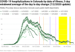
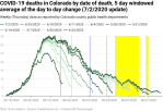
The first chart (top right) shows the 5-day windowed average of the cases, hospitalizations, and deaths by illness offset. The chart has been normalized in order to focus on the temporal relationships between the three curves. The graph shows that the hospitalizations and cases track each other when they’re measured by date of illness, as we would expect. It also shows how the imposition of various anti-pandemic measures by Governor Polis changed both the rate of growth in cases and simultaneously changed the rate of growth in hospitalizations. The graph shows that there is a delay of about 8 days from rising hospitalizations to a subsequent rise in deaths from COVID-19.
But the cyan highlighted area is the area I want to focus on. It shows how new cases in Colorado are driving increases in new hospitalizations. The relationship is complicated and non-linear and so the simple correlation function (which assumes a linear relationship) is only about 0.5, but the bumps very clearly line up in time, so there is a relationship.
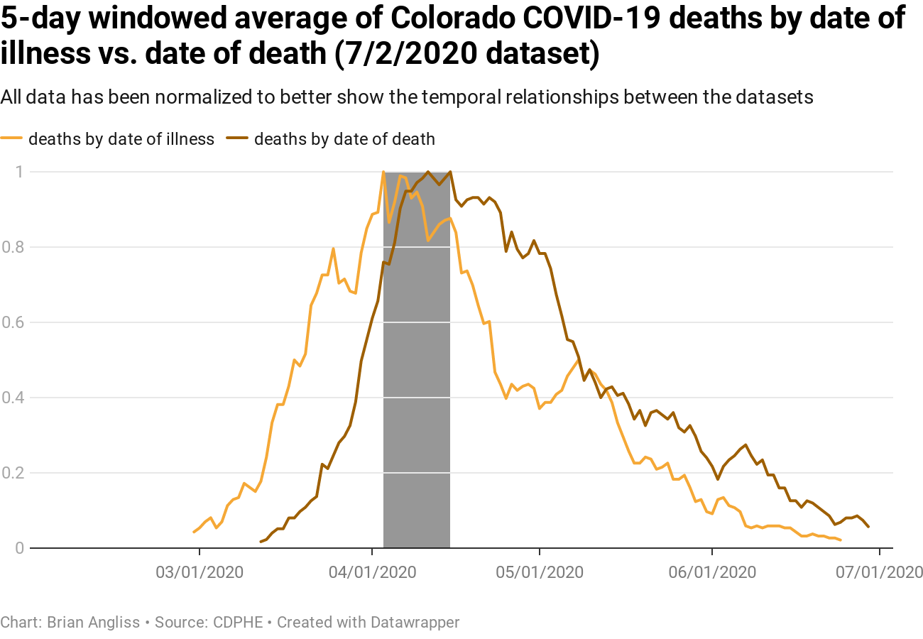
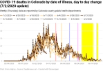
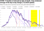
The second chart (middle right) shows the 5-day windowed average of deaths by date of illness and deaths by date of death. Both are again normalized in order to emphasize the temporal relationship between them. The purpose of this graph is to determine a nominal range of delay from illness onset until the date of death. This is shown with the orange-shaded region. It shows that the nominal delay is going to be between 17 and 23 days.
This is important to know because it gives us an estimate of how long after we start seeing new cases it will be until we start seeing an increase in the number of deaths. And from that, we can estimate that we should start seeing new deaths from the earliest days of the new cases (around June 6) between June 23 and June 29. And we should expect to see new deaths from the current peak on June 17 between July 4 and July 10.
Unfortunately, it takes 7-10 days for reporting delays to get the case data to be within 80% of the final value, so we shouldn’t try to make any conclusions about the first days of the spike until next week.
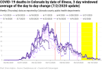
The third chart (bottom right) shows the 5-day windowed average of hospitalizations by date of illness compared to deaths by date of death, again normalized to emphasize the temporal relationship. If we look at the gray highlighted region, you see that we can use the peaks to estimate the delay between when someone shows symptoms of COVID-19 to the point at which they die from it. Just going from peak to peak shows a range of 17-23 days.
We also notice that the curves are nearly identical in shape. They’re so close in shape, in fact, that the correlation coefficient between the two curves is 0.979 with a delay of 19 days. We have to be careful because both curves are filtered (5-day windowed average) data and that somewhat increases the correlation of any two datasets. If we use the raw data instead (which is really the right way to do it), the correlation drops to 0.909 with a delay of 17 days, which is still a strong correlation. Both our methods – comparing peaks visually and statistical correlation – show that we should expect to see 17 or slightly more days between a statistical person showing symptoms of COVID-19 to the point they die from the virus.
That’s it for the charts. I’ll update these sporadically as important or interesting features show up. Now on to the calculations part.
I was politely disagreeing with another Coloradan on Governor Polis’ Facebook page about the seriousness of COVID-19 and the recent increase in cases in the state. I pointed out that we couldn’t trust any day’s data for 7-10 days due to reporting delays and claimed that the 11 new hospitalizations recorded on July 3 and 4 were going to increase. His response was that something I said was “speculative,” but as it was Independence Day, I chose not to ask exactly what he thought was speculation on my part.
It did get me thinking about a better way to measure the effects of reporting delay, however, as well as the effects of ongoing error correction in all four of the data series I’m using – new cases by date of illness, new hospitalizations by date of illness, daily deaths by date of illness, and daily deaths by date of death. I’m still struggling a little with the hospitalization and death data because the metrics I set up for the cases data has a harder time with the smaller absolute number of hospitalizations and deaths, but I’ve got the cases data good enough for now.
I arbitrarily set thresholds of +/- 20%, +/-10%, and +/- 5% around the latest dataset value and then calculated how long the data takes to settle to within those ranges and stay within those ranges. And the results were interesting:
- Stabilizing within +/- 20% of the latest dataset (7/2) value: 9-11 days
- Stabilizing within +/- 10% of the latest dataset (7/2) value: 13-15 days
- Stabilizing within +/- 5% of the latest dataset (7/2) value: 18-23 days
The data shows signs of being more stable recently, with the upper end of the range being closer to the peak of COPVID-19 cases back in April and the lower end of the range being based on the most recent data. But whether that’s because of better reporting, less changes, both, nor something else entirely is beyond the scope of this calculation.
I also looked at how far back we had to go before the data only entered the target range in the data for the 7/2 dataset. This was my attempt to estimate for how many days we could expect revisions to potentially bump us out of the target tolerance range. Again, the results were interesting:
- Revisions unlikely to bounce data out of the +/- 20% range: 17 days
- Revisions unlikely to bounce data out of the +/- 10% range: 23 days
- Revisions unlikely to bounce data out of the +/- 5% range: 32 days
Finally, I looked at the impacts of data revisions on recent days. In every single weekly dataset (always gathered on Thursday) going back to April 2 (the first dataset I analyzed for cases months ago), the last two days of data have been revised upward, and usually by tens or hundreds of new cases. For example, between June 25 and July 2 (the two most recent subsequent datasets I’ve analyzed), the number of new cases increased from 1 on June 24 in the 6/25 dataset to 204 in the 7/2 dataset. And every single dataset shows the same thing – recent case data is always revised, and for the first week the revisions are always upwards.
As we’d expect, given it takes 9-11 days for the data to settle within 20% of its final value.
I haven’t completed the analysis of the hospitalizations yet, but I expect the exact same thing because it’s visually present in the graphs, as you can see in the gallery below or you can review any of my previous COVID-19 posts on the subject (Note the gray shading between different datasets)
In short, neither my claim about the approximate duration of reporting delays nor my claim about how we will see increases in new hospitalizations due to those same reporting delays were speculative in any way.
—
There is no question that Colorado is seeing a resurgence of new COVID-19 cases. The data shows that we are starting to see corresponding increases in new hospitalizations as well. And in another week or two we will, tragically, see associated increases in new deaths.
We can see that Colorado had nearly squelched the epidemic in the state. Yes, Polis probably ended the stay-at-home order a couple of weeks too early, but extending it probably would have done nothing to affect the rise in new cases we are seeing today. The problem is that too few people are social distancing and wearing masks, especially in combination with large indoor gatherings. And too many Coloradans’ values are in opposition to taking the actions that epidemiologists say are necessary to stop a pandemic – values that have been weaponized for political purposes by Donald, the Republican party, and rightist radicals masquerading as conservatives.
The science is abundantly clear. Wear a mask, social distance, avoid large gatherings especially when they occur indoors. We can still turn things around here in Colorado if we make the right choices. I hope that the Governor has the courage needed to lock the state back down if it becomes necessary. And the fewer masks we wear, the less we social distance, and the more we gather indoors in large numbers, the more likely lockdowns will become.
And above all else, listen to what the scientists and authentic experts tell you. And no, Fox News, OANN, Breitbart, Republican politicians, and Donald’s twitter feed are not authentic experts.


Leave a comment