
Another week of data, another update to the COVID-19 observations on data variability, backdating noise, and maybe – maybe – a little bit of very cautious optimism.
The number of new cases every day keeps increasing, which is bad. The number of new hospitalizations per day has been decreasing, which is good. There is no apparent trend yet in the number of new deaths per day (by date of illness onset) and the apparent peak in the number of new deaths by date of death isn’t yet reliable.
And while it looks like there might be a spike in new cases, hospitalizations, and deaths starting on April 20 (the day after protests in Denver), it’s too soon to say for sure if they’re connected or just random noise.
So what can we say and what have we learned in the last week?
COVID-19 cases in Colorado, by day of illness onset
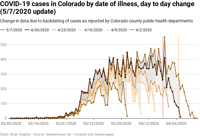
I’ve highlighted a couple of key dates to the graphs this week: April 19 (red line) and April 27 (orange line). April 19 was the day that Operation Gridlock hit Denver and there were anti-stay-at-home protests. April 27 was when Governor Polis started to relax the statewide stay-at-home order to “safer-at-home.” If either event is linked to an increase in the daily number of cases, hospitalizations, or deaths, we should start to see indications of that in the data.
In fact, we do see a spike in the daily number of cases on April 20, the day after the protests, and the spike is so large that April 20 is the new peak in cases in the raw data (pulled forward from April 1 in last week’s dataset). The April 20 maximum was likely to become a new maximum given what we knew last week – there was only 23 cases between the April 1 maximum and the second highest peak on April 13, and there was only 33 cases between the April 1 maximum and the third highest peak on April 20.
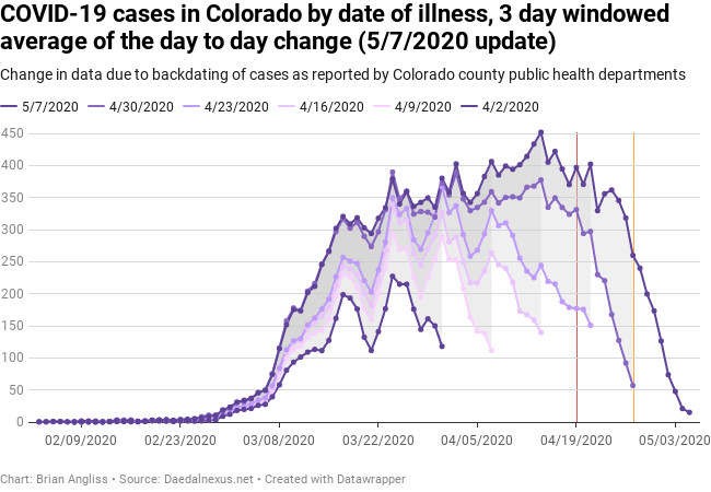
Based on the 3-day window average graph, though, you’ll see that the peak moved forward to April 13 instead of April 20 like in the raw data. April 19, 20, and 21 are all about the same in the 3-day moving window. The April 20 peak is almost entirely erased by the deep troughs on April 19 and April 21.
We can also see two features becoming apparent. First is a steady, but slow, increase in the daily number of new cases every day week after week after week. I’ll dig into this more below, but it’s clear that the daily number of cases is not falling, it’s still increasing.
The second is that the CDPHE COVID-19 case data isn’t mostly stable (changing by less than about 5 cases up or down) until about a month after the day in question. My previous reviews of the other datasets indicated the daily new cases data was taking about a month to stabilize, but with every new week of data the delay is becoming pretty solid. This means that we won’t really know what’s going on with the number of cases in Colorado until a month after it’s happened. We’ll get glimpses, and maybe be able to make reasonable projections a couple of weeks out, but we won’t know for about a month.
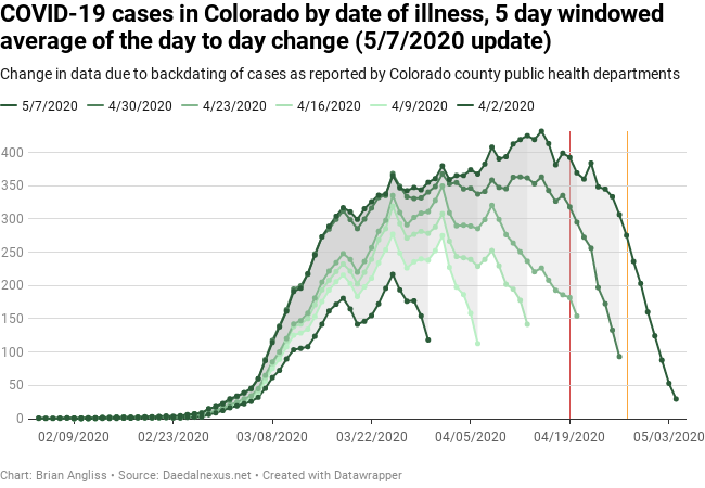
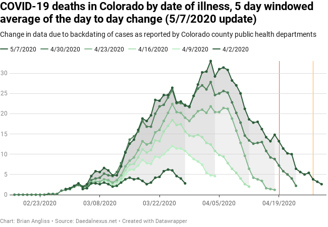
The slow but steady increase in the daily number of new cases every day is even more clearly in the 5-day moving windowed average graph. We can also see that there is a progression in spikes and that the spikes seen in data two or more weeks old stay in the data. For example, the spikes on March 18 and March 25 that showed up in the 4/2 dataset increase and stay in the data all the way up to the 5/7 dataset. The same is true of the spikes on April 1, April 8, and April 15. This suggests that we’re likely to see the spike around April 19 will continue to grow, and the new spike that’s showing up around April 22 will very likely become the global max in the datasets sometime in the next 2 weeks (5/14 or 5/21 datasets).
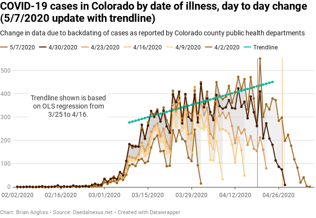
As I mentioned above, there is a slow but steady increase in the daily number of cases every day. We can see that in the bottom image, where I’ve plotted one of the trendlines I calculated (the middle-of-the-road trendline). The trendline is calculated between March 18 and April 16 and it’s increasing at the rate of 3.8 new cases per day. Selecting different endpoints results in a trend as low as 3.5 cases per day or as high as 3.9 cases per day.
What this means is that the daily number of new cases every day will continue to increase from whatever it was today (say 500) to 503.8 cases per day tomorrow, to 507.6 cases per day the following day, to 538 cases per day in 10 days, to 600 cases per day in four weeks. Put simply, the total number of cases is slowly accelerating. This isn’t exponential growth any more, but the total number of cases is still a quadratic function, and that’s still going to increase. It’s just going to take longer to get to really bad numbers of cases. Maybe enough longer that Colorado’s healthcare system will be able to catch up.
But then again, maybe not. Time will tell.
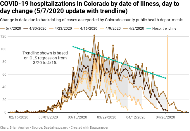
COVID-19 hospitalizations in Colorado, by day of illness onset

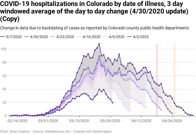
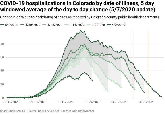
Now let’s look at Colorado’s daily hospitalizations by date of illness onset. Unlike the daily cases data discussed above, the daily hospitalizations data shows signs of slowing. But as we can see from the peak on April 20, there may be indications that a spike in infections may be occurring following the anti-lockdown protests that happened on April 19. The problem is that there’s so much variability from one day to the next that it’ll be at least another week before we know for sure.
Unlike the graphs for the daily number of cases, it looks like the data for the daily number of hospitalizations per day is taking longer to stabilize. Up until now it’s looked like the data was stabilizing after about 16-18 days, but there were a lot of changes in the last week that updated the daily number of hospitalizations as far back as a month ago. As a result, we can see from the raw data and 3-day moving window filtered data that the number of daily hospitalizations back in March increased significantly. The increase back in March resulted in increasing the apparent deceleration in the number of daily hospitalizations.
I used both the 3-day moving window and the 5-day moving window to estimate three different slopes for the trend in daily hospitalizations, and they vary from as low as -0.8 hospitalizations per day to as high as -1.5 hospitalizations per day, depending on the specific endpoints. The trendline shown is a -1.1 hospitalizations per day line, and while it looks to be a little too shallow, it could be reasonable given how noisy the raw data is. In this case, 100 new hospitalizations today would drop to 98.9 new hospitalizations tomorrow, and to 89 new hospitalizations in 10 days, and down to 0 new hospitalizations in three months, after which the COVID-19 wards would be able to slowly close down.
The deceleration is generally a good thing as it means the health care system will be more likely to be able to keep up with the number of COVID-19 cases. The problem is that the two competing trends – accelerating daily number of cases and decelerating daily number of hospitalizations – aren’t known well enough to say which trend will dominate. If the hospitalization trend is closer to -1.5 new hospitalizations per day than the nominal -1.1 cases, then we’ll continue to see a decrease in the overall number of hospitalized patients with COVID even though the total number of cases is increasing. Not by much, mind you – by about 1 person every day and a half – but decreasing nonetheless. If the hospitalization trend is closer to -0.5 new hospitalizations per day, then we’ll see the total number of people being hospitalized each day gradually flatten out and then start to increase, but at a very slow rate of about 1 person every week.
Anything that drives up the number of new cases per day will reverse the trend in daily hospitalizations. The more we gather in large groups, the less we social distance, the fewer of us who wear masks, the faster the number of new cases will accelerate.
COVID-19 deaths in Colorado, by day of illness onset
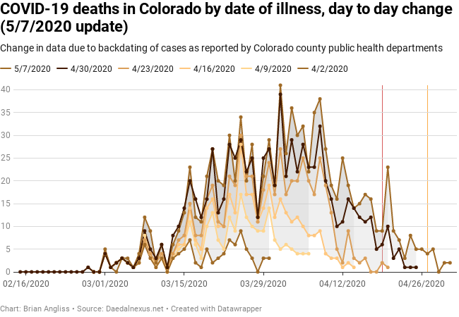
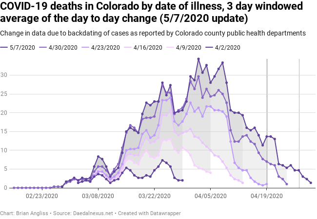
Unlike both the new cases per day and the new hospitalizations per day, the number of new deaths per day by date of illness doesn’t yet show a specific trend. The raw data is as variable as it’s always been, and the 3-day moving average shows a large drop around April 11th. But there’s no indication of what the cause of that large drop might be, and so it’s still quite likely that data is simply unstable a month back.
As with the new cases per day and new hospitalizations per day, there is a spike on April 20, the day after the Operation Gridlock protests. But it’s too early to say whether that’s just noise or will be attributable to the protest.
There are physical reasons for this, not just my observations of how unstable the data is. The main reason is that the progression of any illness is from contracting the illness to showing symptoms to getting so sick from it to need hospitalization to either recovering from it or succumbing to it and dying. With COVID-19 the time between cases and needing hospitalization can be weeks, and then the unlucky people who die from it will take up to another week or so to die from it. In addition, it also takes time for individuals who die from COVID-19 at home to be discovered (if they live alone), date of death to be determined, and their cause of death to be positively identified as COVID-19. It’s not until weeks after showing symptoms that any fatality is attributed to the virus.
It’s important to note that the data shows signs of continuing growth in the number of deaths per day. The dataset from 4/23 had its peak on March 25, but each of the last two weeks’ datasets (4/30 & 5/7) have their peaks on April 1. And we can see from the 3-day moving window graph that the next peak a week later (April 8) rose a great deal in the last week and is very nearly the same as the April 1 peak. Given how the April 1 data has become reasonably stable, we shouldn’t be surprised if April 8 becomes the new peak in the next week or two. That would mean that we’re probably not as close to the peak number of deaths (as measured from the date of illness onset) as we would hope to be.
I hope to be able to see a downward trend in the number of deaths from one day to the next soon, but thus far the data isn’t showing that. The data has never shown a reliable decrease in deaths since the start of the pandemic. Hopefully that will change soon.
COVID-19 deaths in Colorado, by date of death
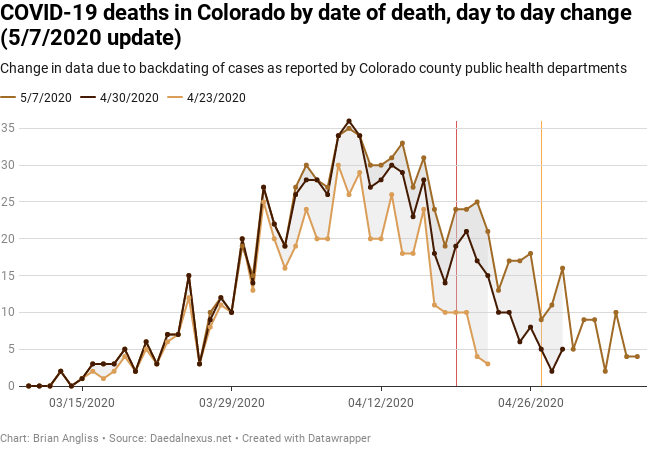


With three weeks of data on daily deaths by date of death (the day that the person died as opposed to the day the dead person got sick), we can finally start making some observations about the data.
The first observation is that the data is just as variable as all the other data has been, so it’s hard to draw conclusions on just the raw data. The second observation is that the peak has been very stable so far, staying on or about April 8 since the deaths by date of death data has been available.
Third, the peak in the number of deaths by date of death is about a week later than the number of deaths by illness onset. This could easily change, but it’s logical because someone who dies due to COVID-19 isn’t going to die before they catch the virus. In fact, it gives us a way to test the data on deaths per day. If the two different measurements of deaths get too close together or even cross over, then something strange is going on. Given the noise we’ve seen due to the backdating of data, most likely the data isn’t keeping up with what’s actually going on with respect to COVID-19 deaths.
Fourth, we’re starting to see the downward slope after the peak push out and become flatter, most clearly shown in the 5-day moving window graph. It’s starting to look like the hospitalization data between the 4/16 and 4/23 datasets – pushing out slightly, but only enough to make it look like a slowing in the number of deaths. This makes sense because the number of deaths by date of illness onset hasn’t started to decline noticeably or reliably, which means that there are a lot of people who are sick but haven’t either a) recovered or b) died yet.
I expect that next week we’ll see a moderate shoulder in the data that indicates a significant increase in the daily number of deaths by date of death, much like how a shoulder formed between 4/23 and 4/30 in the daily deaths by illness onset data. Hopefully we won’t see a shoulder like what formed in the daily hospitalizations by date of illness onset between 4/23 and 4/30.
—
Let’s summarize. The number of new cases of COVID-19 continues to slowly increase, albeit at a lower level than exponential growth. The number of new hospitalizations per day is dropping slowly, but maybe enough to keep up with the slow growth or cases. There’s so much variability in the daily deaths by date of illness onset that we can’t yet see a trend in the data even if there is one. And the data on daily number of deaths by date of death shows signs of a slower decrease.
What does this mean?
There’s a few indications that provide some room for very cautious optimism, namely the negative trend in daily hospitalizations and the fact that this trend may eventually outweigh the increase in number of daily number of cases. But anything that increases the number of cases – stopping social distancing, gathering in large groups, not wearing masks, staying in close proximity – will overwhelm this slightly negative trend.
Now is not the time to let up on those practices. Now is the time to continue them, however frustrating they may be.
Stay at home. Wear masks. Don’t gather in large crowds. Be more conservative than Governor Polis is being.
