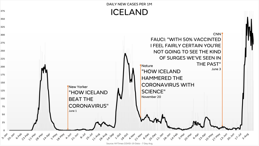
This graph’s creator is an expert at lying with graphs, and I’m seeing his work all over social media

If you see graphs in the style of what I’ve included in this post, be aware you’re looking at something created by a master of lying with graphs. A couple of places you can look to easily see the disinformation include, but are not limited to, the Y-axis and the units.
Often curves look very similar and equally bad when the Y-axis is scaled to fill the box, and that’s exactly the conclusion this graph’s creator wants you to draw. But if you look at the axis in the image above, it tops out at 374. If we compared that to just the state of Florida, their graph would top out at greater than 1000.
Also note that Iceland has a total population less than a million people, so scaling cases to 1 million population is inappropriate. The only reason to so is to make the number bigger (by 10x), and thus make it appear worse than it actually is. If the graph’s creator was doing a direct comparison between two countries then scaling them to be on the same units would make sense, but he isn’t doing that here.
In other graphs created by this same guy, he uses raw count of new cases, sometimes he uses count scaled to 100k population, and sometimes he uses count scaled to 1M population. While the numbers are always correct, the scale variation creates confusion when looking at multiple graphs and encourages viewers to draw the wrong conclusions.With respect to Iceland, the maximum number of recent cases was 170. Again, Florida alone maxed out recently at over 45,000. If we use the more stable 7-day average of new cases per day, Iceland’s news cases are 116 while Florida is over 25,000. Differences like this matter, but the graph’s creator wants you to misunderstand them.
In addition, the graph’s creator never presents a critical piece of information, namely that the surges represent different variants that have different transmissiblities. The alpha variant (last fall’s surge) had an r0* of about 2.5, while delta’s r0 is at least 5 and may be even higher. By not including this critical information, he leads his readers to draw wrong conclusions about whatever his issue is – vaccine effectiveness, masking effectiveness, case rates, hospitalizations, etc.
The creator of this graph has made dozens of other I’ve encountered on social media, and in every case the numbers are carefully selected and presented in a way that maximizes the viewer’s opportunity to misinterpret, misunderstand, and draw the false conclusions that nothing stops COVID, masks don’t work, the vaccines are useless or even dangerous, and other incorrect conclusions. As I said, lying with graphs. If you see COVID graphs of this style, be very careful reading and drawing any conclusions from them, and be aware that the conclusions that others are drawing very likely wrong.
Notes:
* R0 is the reproduction number and it represents a rough gauge of how contagious a disease is by estimating how many other people, on average, a single infectious person will infect.
Talk about the pot calling the kettle black.
To even include the statement “Florida alone maxed out at 45,000” is far worse than what you are accusing others of doing, because Florida stopped daily reporting. The 45,000 number means literally nothing.
As it stands, the graph you are criticizing did a better job presenting the data than you are. You mention the 7 day averages of Iceland and Florida as 116 and 25,000, but to even include that comparison is grossly misleading, as the population of Florida is ***60 times larger *** than that of Iceland.
When correctly normalizing by population (as the graph did) you get 1,163 and 324 per mil for Florida and Iceland respectively.
The outbreak in Florida is clearly worse, but the outbreak in Iceland is not minor.
The point being made by that graph is valid.
Congratulations, you have been hoodwinked by disinformation.
First, I made your same exact point about normalizing for population when I compared it to Florida: “If we compared that to just the state of Florida, their graph would top out at greater than 1000.”
Second, you entirely missed the point of the section where I mention Florida’s daily, namely that the graph’s author wants you to draw wrong conclusions from his graphs by varying the scales: “In other graphs created by this same guy, he uses raw count of new cases, sometimes he uses count scaled to 100k population, and sometimes he uses count scaled to 1M population.” Your complaint about my using averages is an illustration of my point, not a counter to it.